Realstir
Featuring social search tools, InstaValue home value estimates, and the first-to-market Try Before You Buy® service, Realstir is an online real estate marketplace for home buyers and real estate professionals.
- User Experience Research
- UI Design for Web, iOS, Android, and Apple TV
- Design of Marketing Materials
- Front End Development
Overview
During my time as Realstir's UX Designer, I updated the Realstir website and mobile apps, designed an application for Apple TV's tvOS, and developed modular elements and a pattern library based on existing product feel. I conducted user inquiries, tasks analyses, and competitive audits, using the results to drive design strategy. For some projects, I prepared detailed design specs for our in-house and off-shore development teams, and for others, I helped out with front-end development.
01 • In the beginning...
After arriving at Realstir, my initial user interviews showed that incongruous design choices across our platforms and features were creating confusion, especially for our multi-platform users.
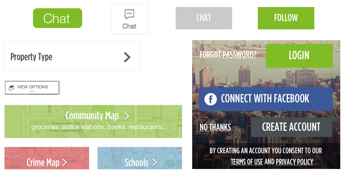
For example, Figure 1.01 shows some of the many button styles I found across Realstir applications. The inconsistent visual styles and interaction behaviors were a challenge for users.
Additionally, many elements failed to meet accessibility standards (for minimum contrast, meaningful sequence, etc.), and navigation patterns that broke in unpredictable ways from Apple and Android’s design guidelines left users feeling lost.
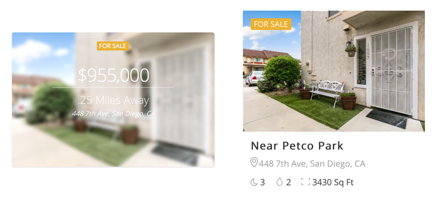
Figure 1.02 shows two variations of a "For Sale" listing widget. The left version brought up accessibility (and readability!) concerns, and the differences between the two widgets showed that Realstir was in need of more consistent and deliberate design choices.
02 • A Modular Approach
In order to simplify development, help Realstir users navigate confidently across features and platforms, and support a recognizable brand identity, I designed modular elements with a uniform visual style and consistent interaction behavior and used those elements to initiate a more cohesive design system.
One of those modular elements was the Social Card (figure 2.01) which was designed to display Realstir's social content, like chat messages and market updates from local experts.
By keeping key information — the content’s creator, the content, and relevant interactive options — in a consistent place across all social content (figure 2.02), we ensured that our users were able to successfully and confidently use new social features.
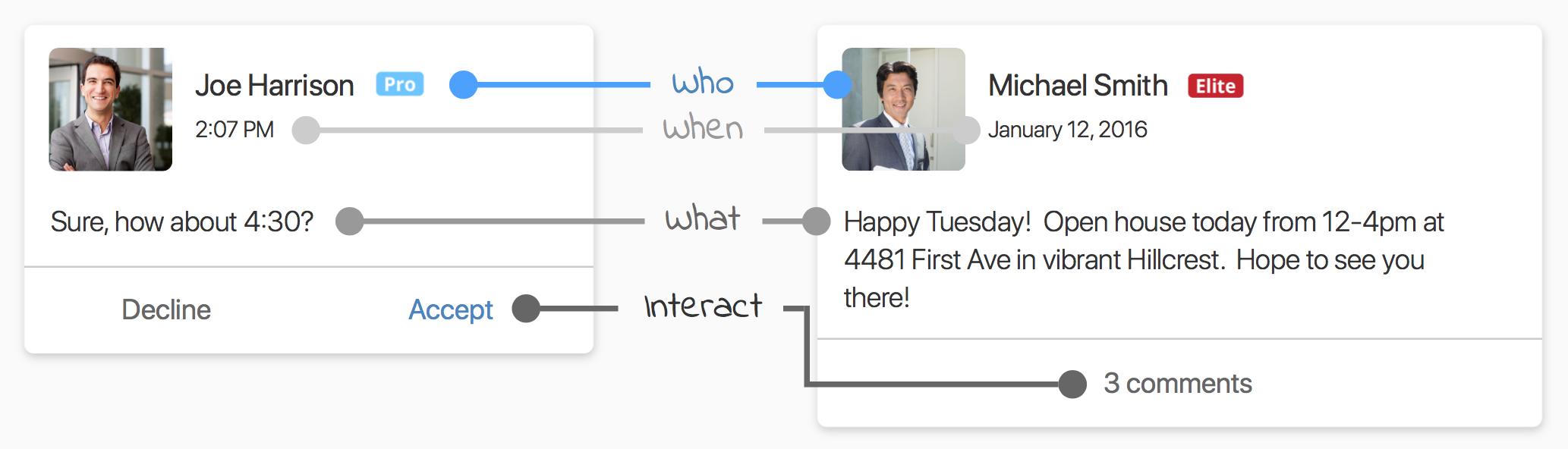
The responsive card was designed to accommodate our users' wide range of screen sizes and be placed in a variety of layouts. I also created modular elements for property listing details, InstaValue home value estimates, and search results, all with a similar UI.
03 • Bring in the agents!
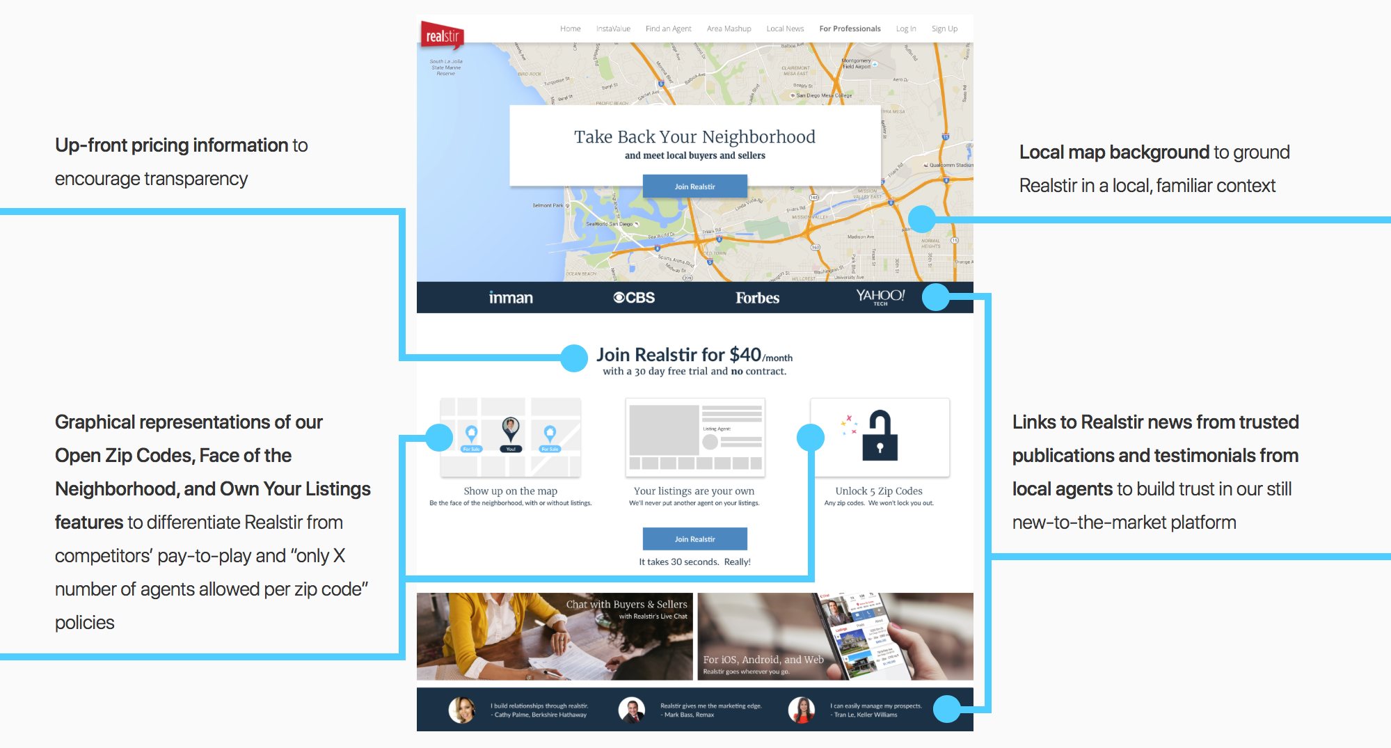
Disappointed with the conversion metrics for the landing page that was created to appeal to real estate agents, Realstir tasked me with designing a new agent portal. To get started, I focused on the following sentiments from our real estate agent user base:
I want to be the only agent shown on my listings.
I’m tired of pay-to-play sites 'locking me out' of my zip codes.
I want to see upfront pricing.
When designing the new landing page for our agent portal, I chose to showcase Realstir features that aligned with these sentiments, as shown below in figure 3.01:
Changes to Agent Onboarding
The previous new user sign-up flow required agents to fully flesh out their profiles in order to interact with the platform; the glut of fields led some users to abandon the sign-up process entirely.
In the redesigned version, after collecting credentials for a new account, the sign-up flow focused on information that we knew agents cared about, like picking their zip code "farming area", while delaying non-essential tasks, such as uploading a profile photo and adding contact information, until the user was ready to utilize those features.
Results
After implementing the new landing page and simplified sign up flow, the registration task success rate increased, and during my time at Realstir, our user base grew from 120 to 1006 enterprise "local expert" accounts.
04 • An iOS App Redesign
When tackling Realstir's iOS App, I started with the basics: simplify navigation and use permission priming and clear tutorials to improve the onboarding process.
Improving Permission Priming
When users opened the Realstir app for the first time, they were abruptly greeted with a flurry of permission requests (figure 4.01), including notifications and location requests.
Research, including this study by clutch.co, shows that users find it important to know why an app is asking for certain information, including access to system permissions. Additionally, immediately requesting access to permissions during onboarding, before those permissions are actually needed for app functionality, has been shown to diminish user trust and lead to decreased permission allowance.
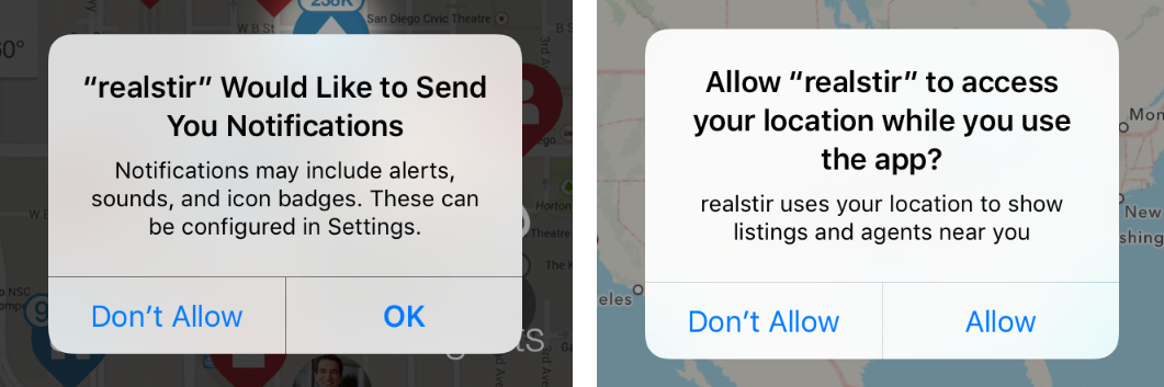
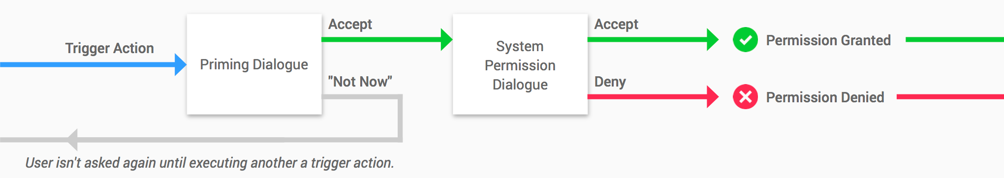
To increase permission allowance and encourage user comfort and trust, I chose to implement priming dialogues and action-triggered (as opposed to upon-download) permission requests. For users who want to allow permission access, these priming explanations prepare them for the "official" (system) permission request, letting them know why we want access to that permission and providing them with a "heads up." For users who aren't open to allowing permission access, these priming dialogues "catch" them before they get to the system's dialogue.
Below, Figure 4.02 shows both of these scenarios. If a user says "Not Now" (grey line) to the Priming Dialogue but later wishes to allow access to the permission, they are saved a trip to the iOS Settings app in order to grant access.
When selecting trigger actions and writing copy for the priming dialogues, I followed three principles:
- Request a permission only when we can offer added value in return for the user's trust.
- Answer the question "Why do you want access to this permission?" with a trust-building statement (for privacy-related permissions, like Location Services or Camera access) or a value proposition (for potentially-annoying permissions, like Notifications).
- Use a verb for the "OK" button in order to make it clear what will happen if the user says "OK."
The table below shows some of the trigger + explanation pairs I wrote for iOS notification priming:
"What?"
"When?"
"Why?"
Realstir will never broadcast your exact location.
Onboarding Tutorial
The existing onboarding tutorials were cluttered and difficult to read (figure 4.04). To improve them, I designed a template for the four tutorial screens, which consisted of a product screenshot and information about the feature set against a background gradient, ensuring that text and tutorial navigation were legible and visible (figure 4.05). Finally, I animated the onboarding tutorial with a simple, friendly spring effect (figure 4.06).


Navigation Improvements and Redesigning Realstir's Live Chat
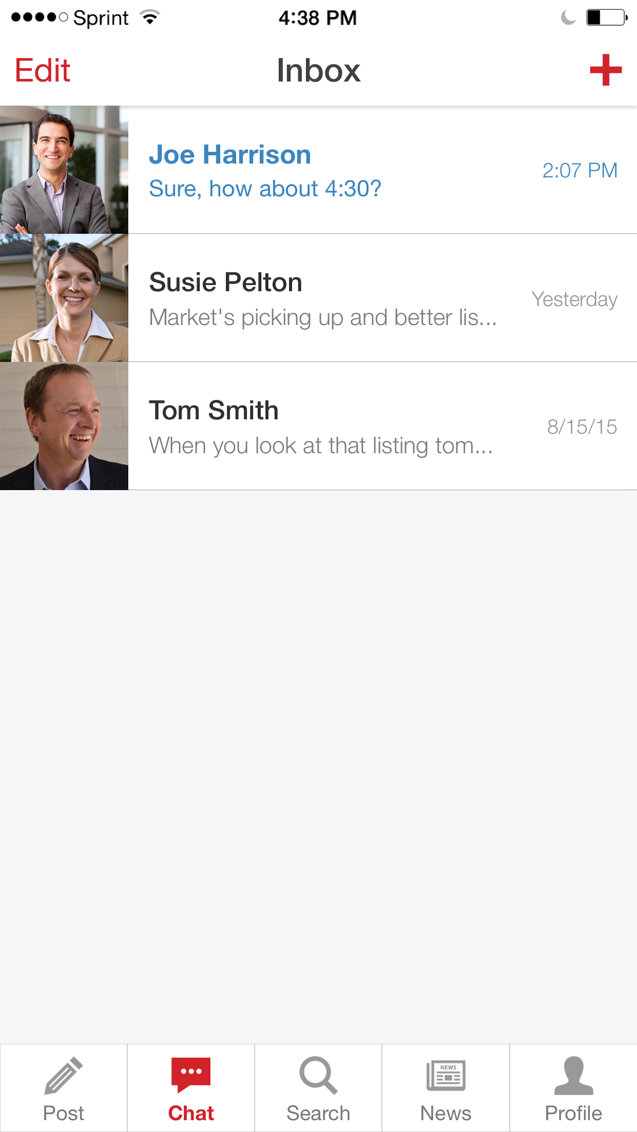
Earlier versions of the Realstir iOS app utilized too many forms of navigation. When I arrived at the company, navigation links were scattered across a tab bar, a hamburger menu, and navigation bar dropdowns, where they were hidden and jumbled with non-navigational actions. To address this,
- I eliminated the hamburger menu and moved the links inside to more relevant places.
- I moved navigational links out of the Nav Bar dropdowns, leaving only non-navigational action buttons that applied to the current view.
- In situations where there were 2+ action buttons that could be collapsed into 1 action, I ditched the dropdown and placed the action directly in the Nav Bar.
For example, a dropdown in the chat inbox contained action buttons to "Edit" and "Delete" conversations. I eliminated that dropdown and implemented the standard iOS inbox pattern:
- User taps "Edit" in the Nav Bar.
- Checkboxes appear next to each conversation.
- User selects the desired conversations.
- User taps "Delete."
- Conversations are deleted.
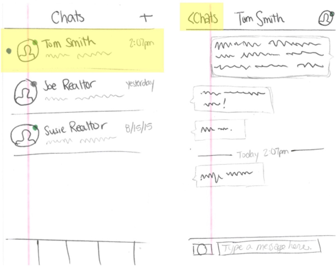
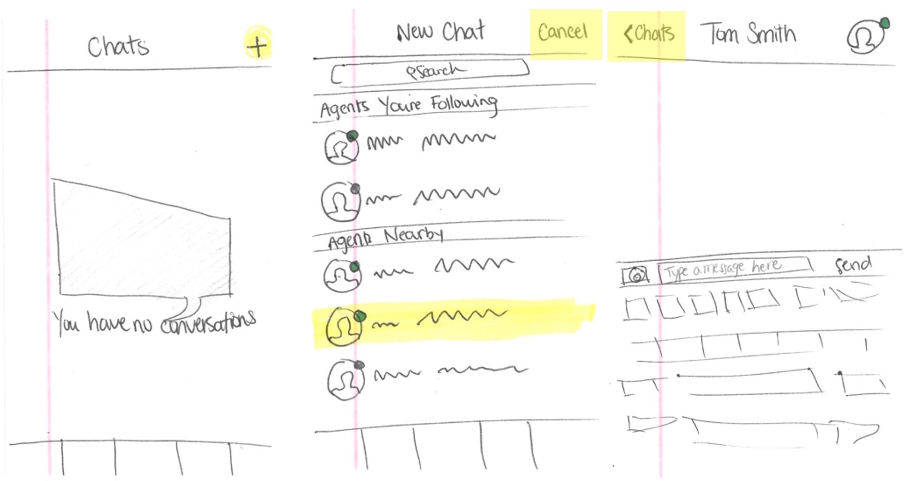
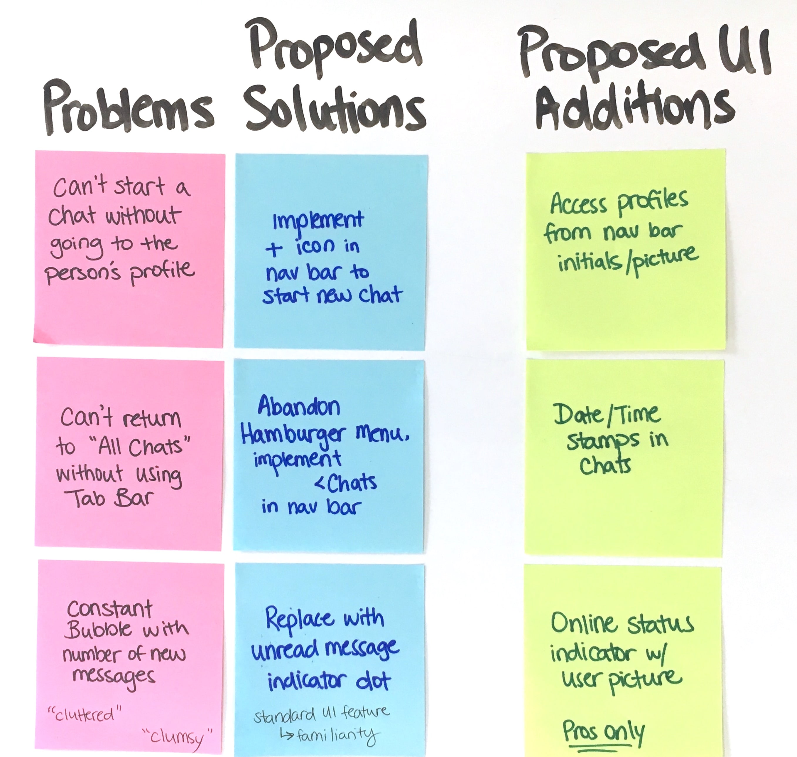
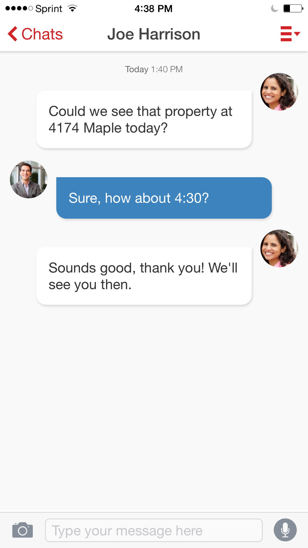
One instance of navigation improvements can be seen below in sketches illustrating two chat task flows. In one task (figure 4.07), the user opens and views an unread incoming chat from a real estate professional. In another (figure 4.08), the user starts a new chat conversation with an agent they haven't chatted with previously. Also shown (figure 4.09) are problem/solution pairings for proposed improvements to the chat interface and proposed UI additions.
After sketching a few iterations of these task flows, I converted them from paper prototypes into interactive "paper" prototypes by scanning them and linking them together in Axure. I then used the interactive prototypes to test the new navigation patterns with users.
After developing interactive, high-fidelity prototypes of the chat interface (figure 4.10), I sent the designs and an element-based specification database to our offshore iOS development team. The specs (created in Airtable) detailed style, positioning, animation, and on-click interaction guidelines for each element.
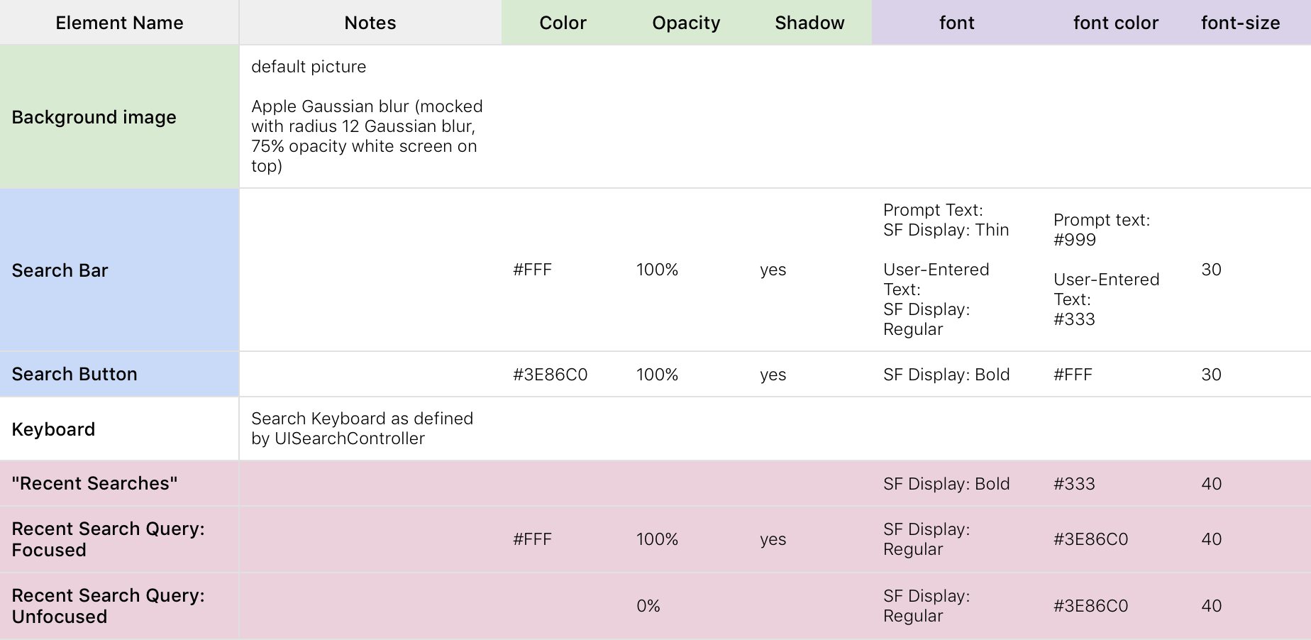
05 • Designing for Apple TV
When our VP of Product announced we would be developing an app for Apple TV, I started researching. I didn’t own an Apple TV, and I hadn’t designed for tvOS before. I started by reading Apple’s tvOS Human Interface Guidelines and taking a deep dive into the Focus Engine, the UIKit system that manages focus from user inputs via the remote.
Upon reading that the Apple TV was among the first mainstream tech products designed for shared experience, I understood why Apple TV would be a great platform for Realstir: for couples browsing homes together and agents showing listings to their clients, real estate is often a shared experience, too. With this in mind, we decided to implement the consumer-facing features that would be the most fun to use in a shared setting: home search and Area Mashup™. Next, we laid out the following task flows and wireframed the task steps (figure 5.01):
-
Home Search:
User enters a search term using the specialized keyboard created by UISearchController. User is presented with the search results: a grid of listings that match the search term. User selects a listing and views photos and details about that listing. -
Area Mashup:
User inputs two real estate markets. User is presented with the Mashup results: a set of listings that match each of the search terms. User selects a listing and views listing detail.
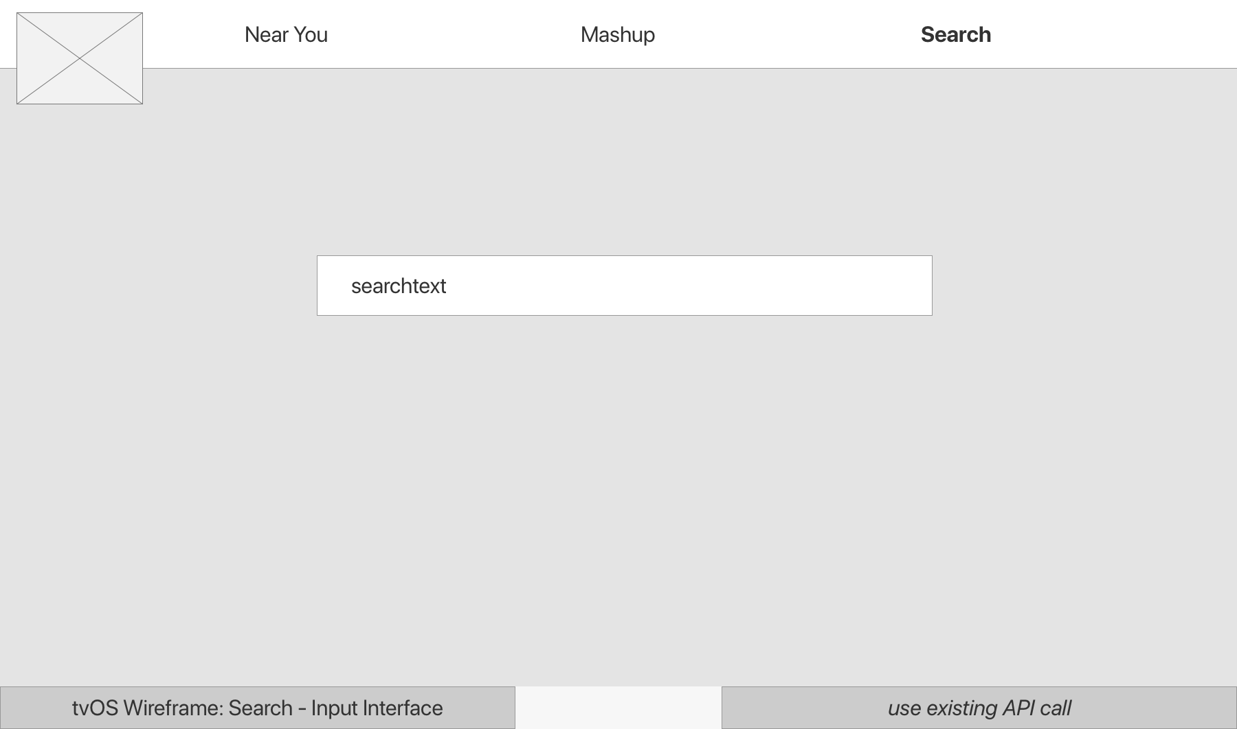
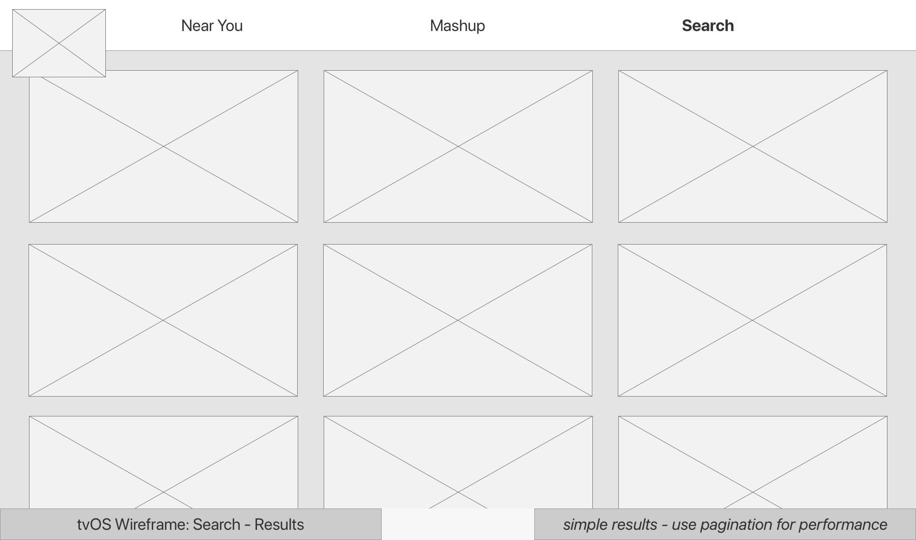
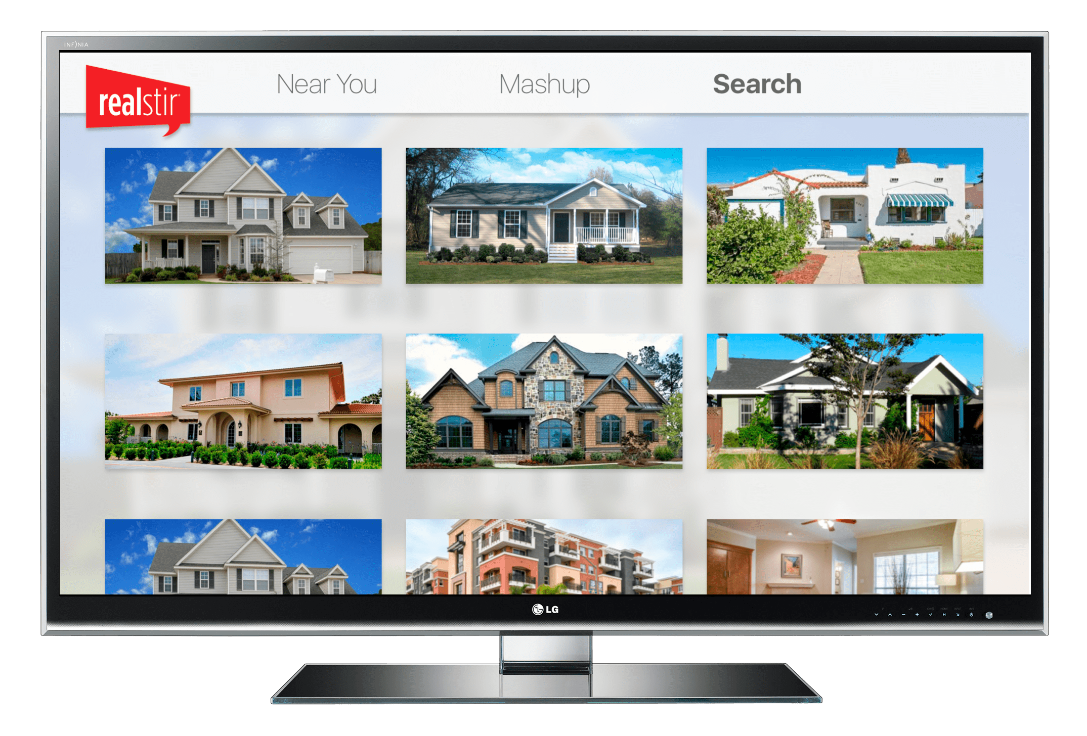
Next, I used Axure to create high-fidelity mockups of the key views: listing detail, Area Mashup, search, and search results (figure 5.02), wrote up a spec document (figure 5.03), and sent them back to our VP of Product for development.
06 • Try Before You Buy®: A First-to-Market Service
Introduction
Realstir created Try Before You Buy® (TBYB), a first-to-market service that allows potential buyers the chance to stay in a currently-on-the-market home for a nightly fee set by the seller; think AirBnb meets real estate. It was pitched with the following set of "User Needs":
- Home Buyers: "I'd like to take a home for a test drive before I buy. What's the neighborhood like? What's it like to wake up in this home?"
- Home Sellers: "I'd like to make money while my home is on the market, and I want a potential buyer to fall in love with my home."
- Real Estate Professionals: "I'd like to help my seller sell their home, and I'd like to help potential buyers be more informed."
The Challenges
When our CEO made the call to implement TBYB®, our VP of Product had the challenge of leading the product team in "inserting" what was essentially an entire vacation rental platform into Realstir's existing real estate website and mobile apps... in a limited timeframe and without testing or research resources available. And I had the challenge of designing that new platform-in-a-platform.
The Requirements
The TBYB Program called for the following user flows and UI elements:
- Home sellers/sellers' agents can "claim" an active listing as their own.
- Home sellers/sellers' agents can make the property available for the TBYB program or opt the property out of the TBYB program.
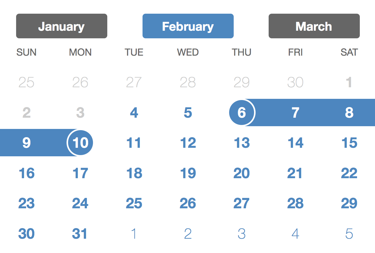
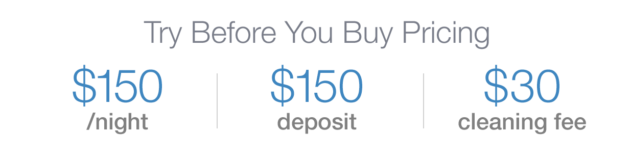
- Home sellers/sellers' agents can set the fees for TBYB stays: nightly/monthly fee, cleaning fee, and/or a deposit.
- Home sellers/sellers' agents can set the availability for TBYB stays with a calendar.
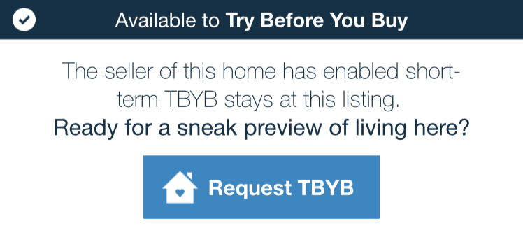
- If a home is available for the TBYB® program, the home's listing page includes a "Book a TBYB Stay" button.
- If a home is not available for the the TBYB program, the listing page includes a "Request a TBYB Stay" button and Realstir will attempt to contact the seller.
- Potential buyers can request a TBYB stay from the listing page, select dates with a calendar picker, include a note to the seller, and add their credit card or PayPal information to pay for the TBYB stay.
- Home sellers/sellers' agents can review TBYB requests.
- Home sellers/sellers' agents can message the TBYB requester.
- Home sellers/sellers' agents can approve or deny the TBYB requests.
- Realstir can collect the potential buyers' TBYB payment and send it to the home seller, deducting Realstir's fee.
The Design
Because I had been moving the Realstir platform towards a modular component-based design system, it was relatively straight-forward to incorporate the above user flows into the existing UI. The TBYB components I created included:

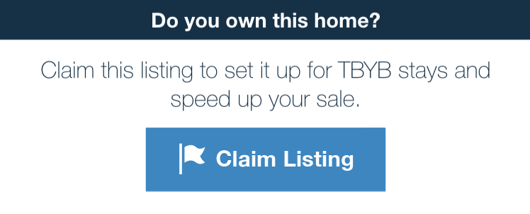
The main TBYB component was the TBYB Status Block, which appeared on each listing on the Realstir platform. I designed 17 states of the status block, allowing for the following variables: Has the listing been claimed? Is the listing TBYB-available? Has the price been set? Who is viewing the listing: seller, TBYB requester, or 3rd party? Has the seller approved the TBYB stay?
The TBYB Status Block was responsive, allowing it to be dropped into the existing Listing pages on both the website and the mobile apps. The actions in this block linked off to newly-designed pages: the TBYB dashboard, the TBYB stay booking flow, or the Listing Claim form. Two of the Status Block states are shown below:
07 • Style Guide, Pattern Library, and Design System
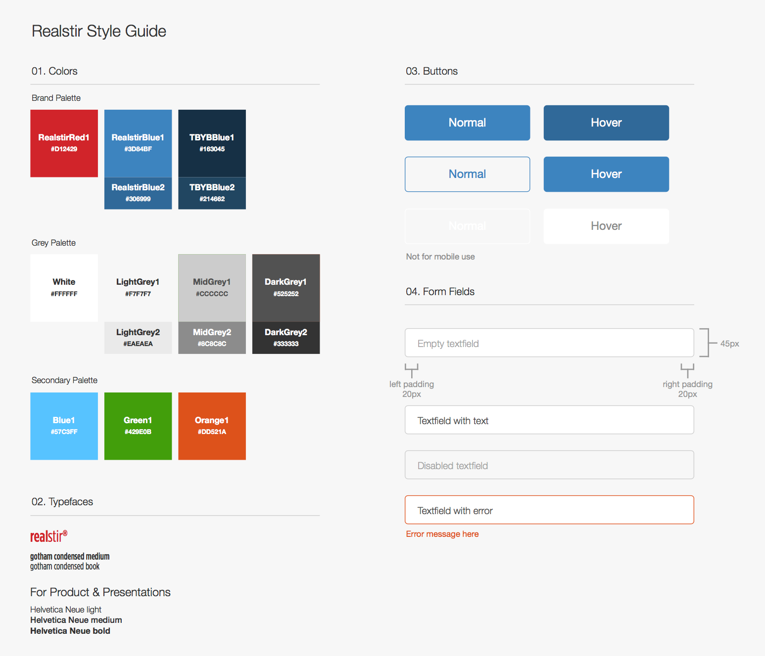
To strengthen brand identity, encourage consistency, and avoid redundant design and development work, I worked with our in-house developers and marketing team to create and maintain a company-wide style guide (excerpt shown in figure 7.01). This visual style guide was later combined with other elements — including a pattern library of UI components (such as the card modules I discussed earlier), iconography, and principles for implementation — to form Realstir's design system.
08 • Marketing Design
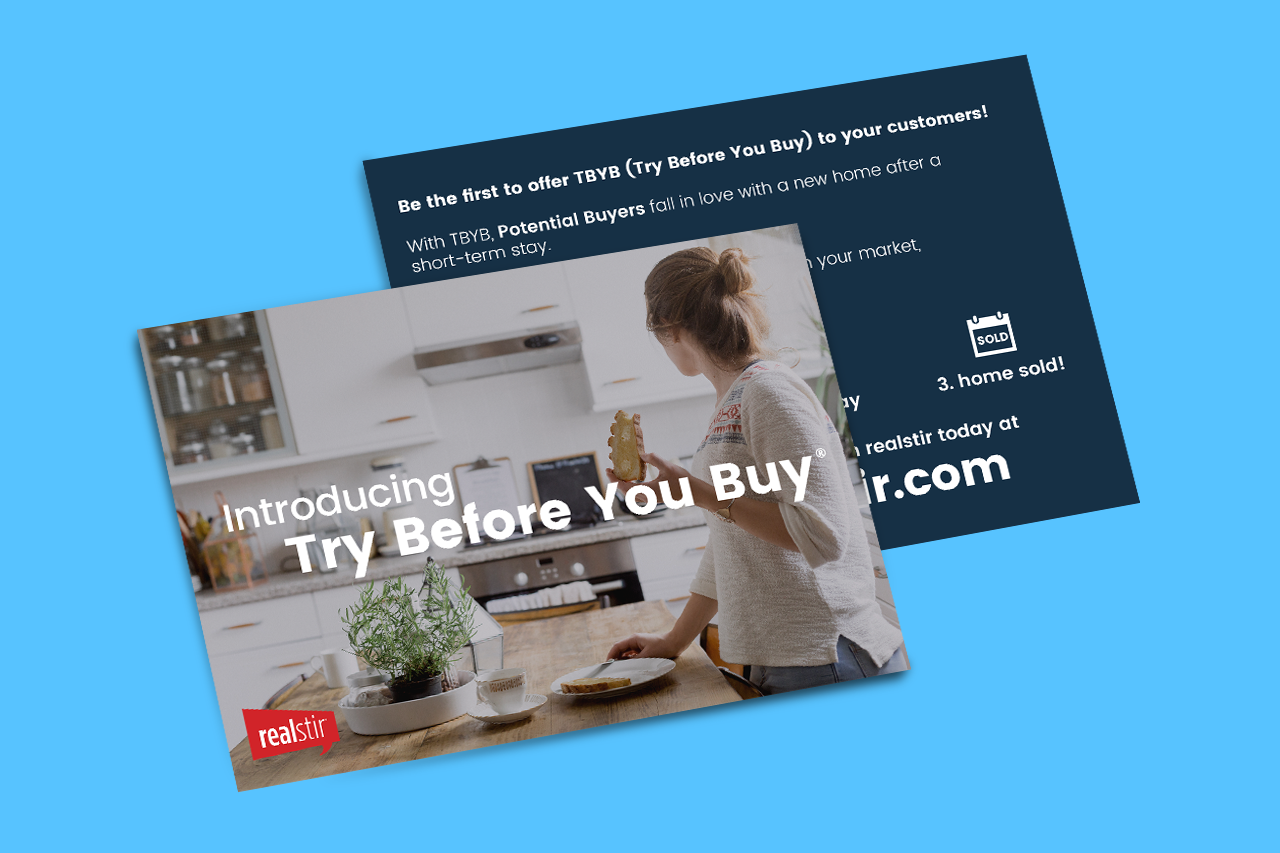
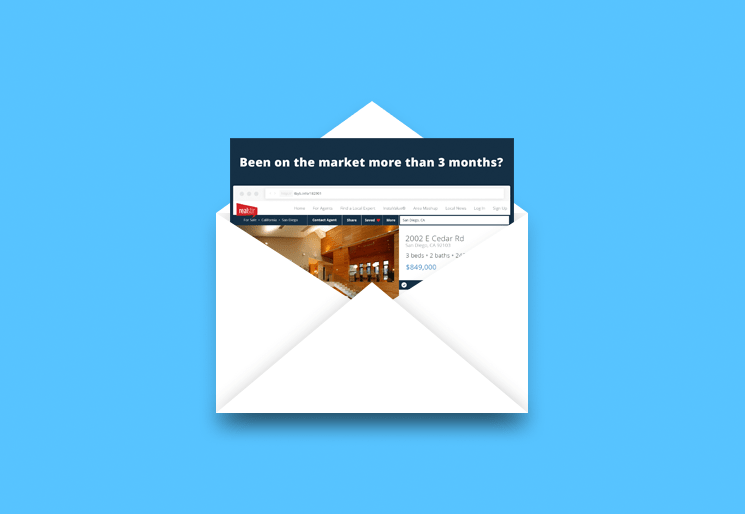
For the launch of Try Before You Buy®, I created a brochure (figure 8.01) that was designed to help pitch TBYB® to home builders and a postcard (figure 8.02) that was to be mailed to home sellers. The postcard included a link (and a scannable QR code) to a TBYB® landing page for their home. The landing page featured an animation I created of the postcard sliding out of an envelope and scaling into the home's Realstir listing page, an introduction to the TBYB® process, and an invitation for them to join the TBYB program.
I also collaborated with the CEO and CMO to style company slide decks for investor presentations and competition pitches, helped the marketing department with email design, and composed an assortment of other visual resources, including banners (prepped for print), flyers, magnets, buttons, and assets for social media marketing.
UX Processes
Strategy & Research
- User interviews
- Product scorecards
- Competitive analysis
Analysis
- Storyboarding
- Affinity diagram
- Onboarding audit
Design
- Sprints
- Wireframing
- Paper prototypes
- Interactive prototypes
Deliverables
Product Design
- UX reports
- Interactive, high-fidelity prototypes of mobile apps, responsive website and tvOS app
- Design specifications
- Pattern library
- Modular UI components
Marketing & Company Design
- Company pitch decks
- Flyers and postcards
- TBYB® branding
- Email marketing design
- Social media marketing assets
Development
- Front-end dev up to the server-side scripting point on some projects
Technologies & Tools
Product Design
- Axure RP 8 and Axure Share
- Principle
Marketing & Company Design
- Adobe Photoshop, Illustrator
- Keynote, Pages, and Numbers
Development
- HTML, CSS, JS, PHP
- Git version control + Github
Productivity & Customer Support
- smooch.io (formerly supportkit)
- Asana
- Google Docs, particularly Google Sheets
- Slack
- Airtable