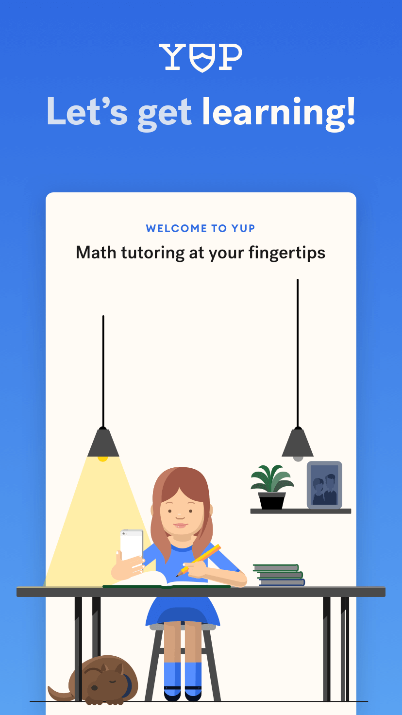
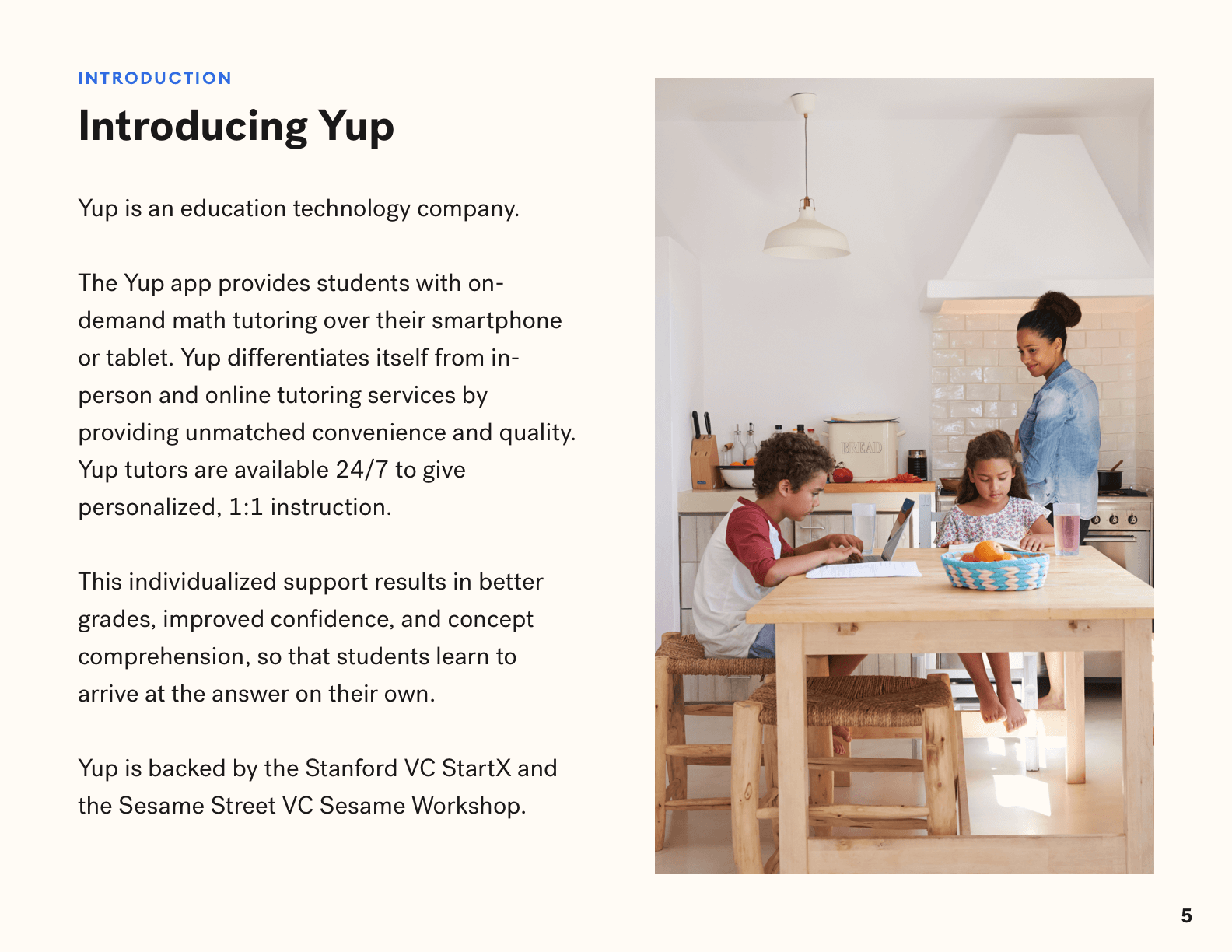
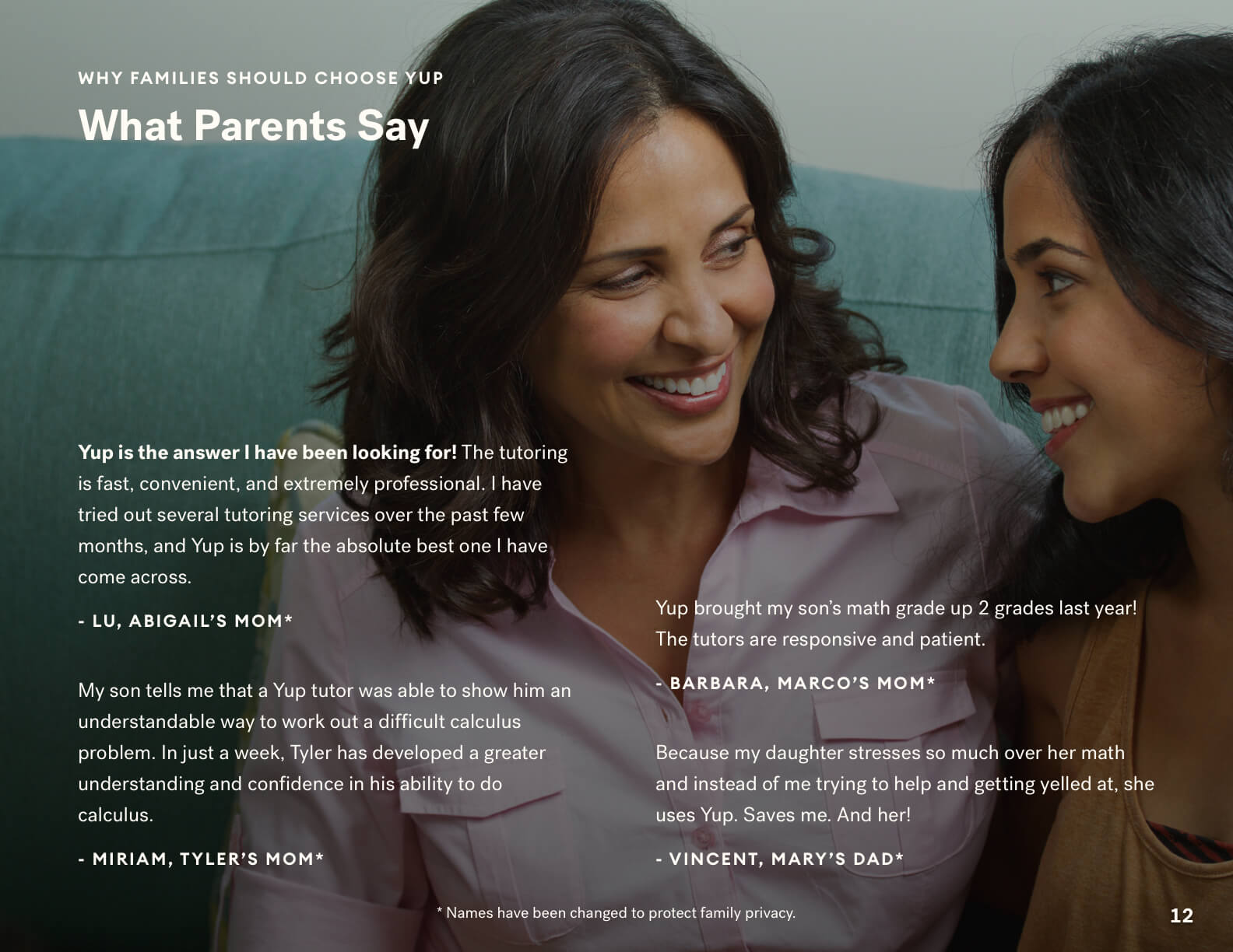
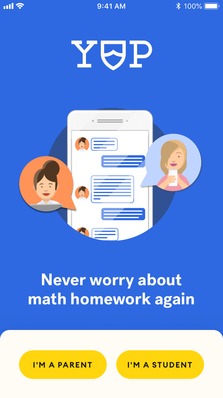
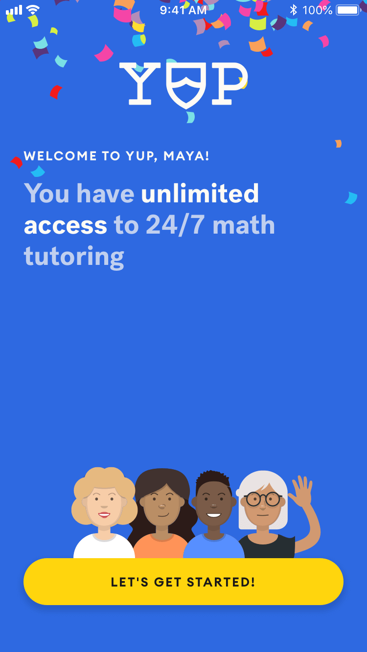
Yup
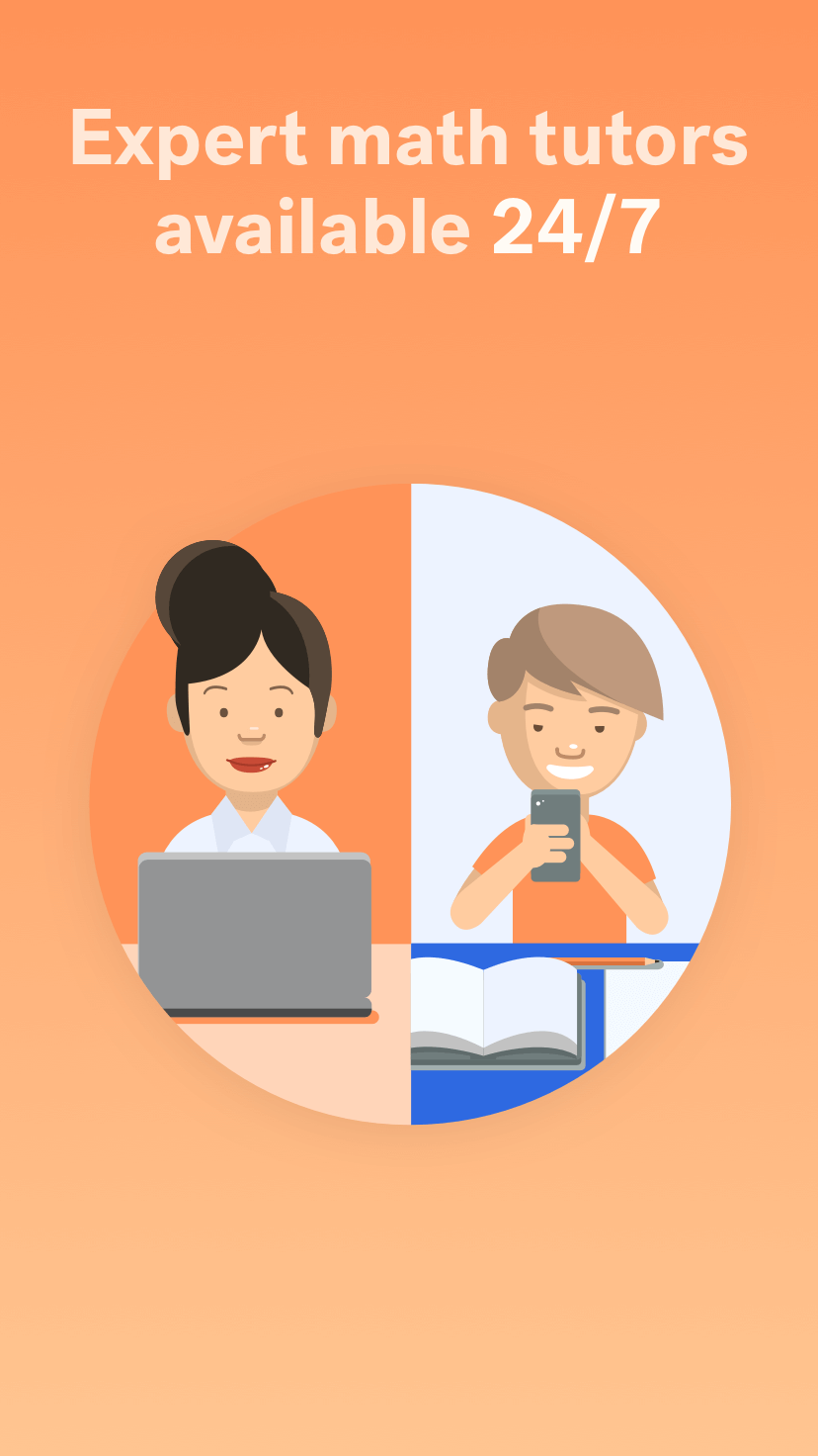
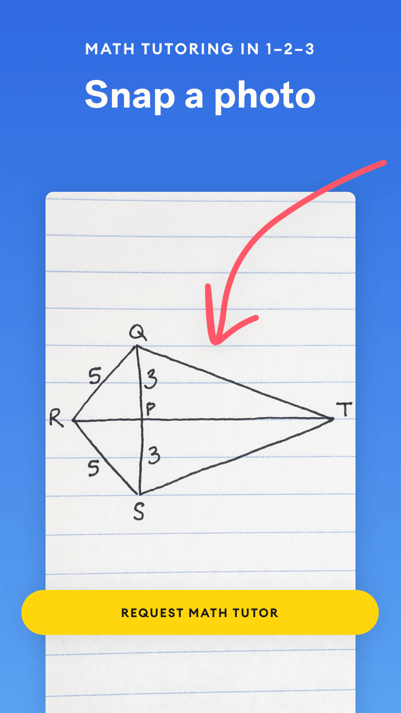
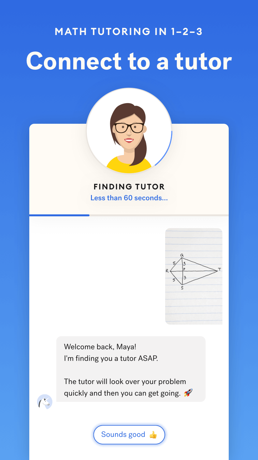
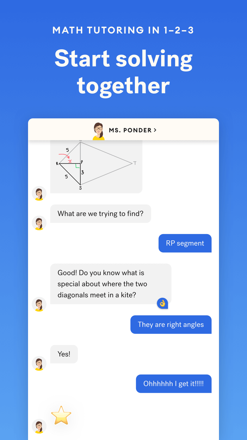
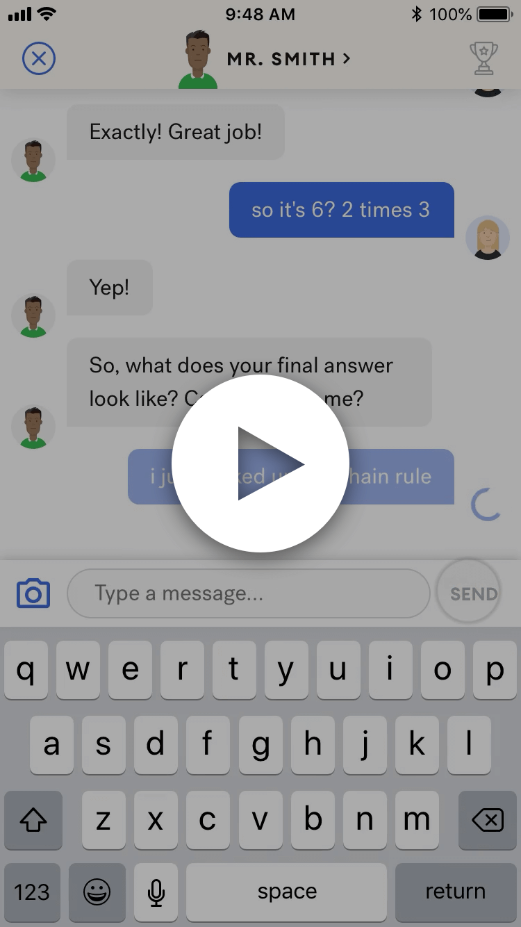
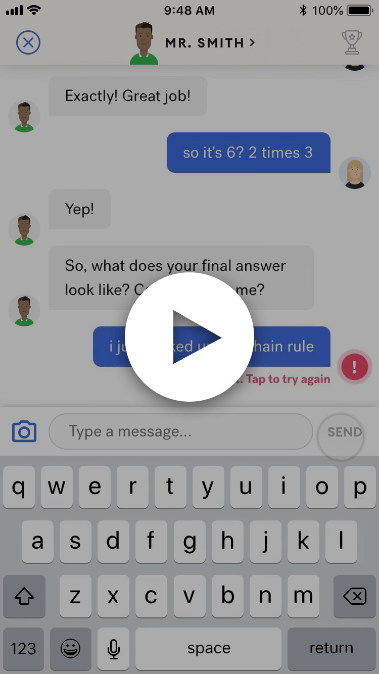
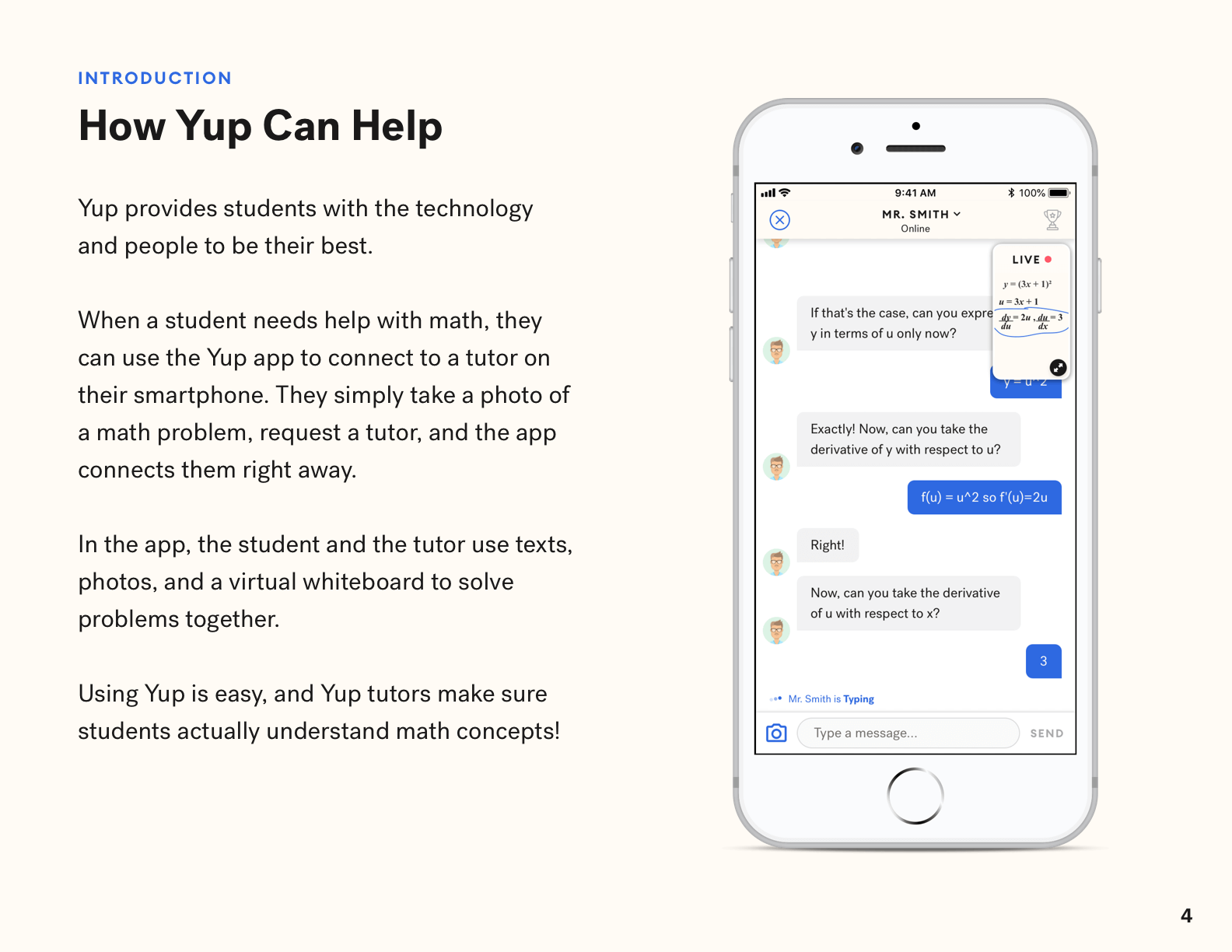
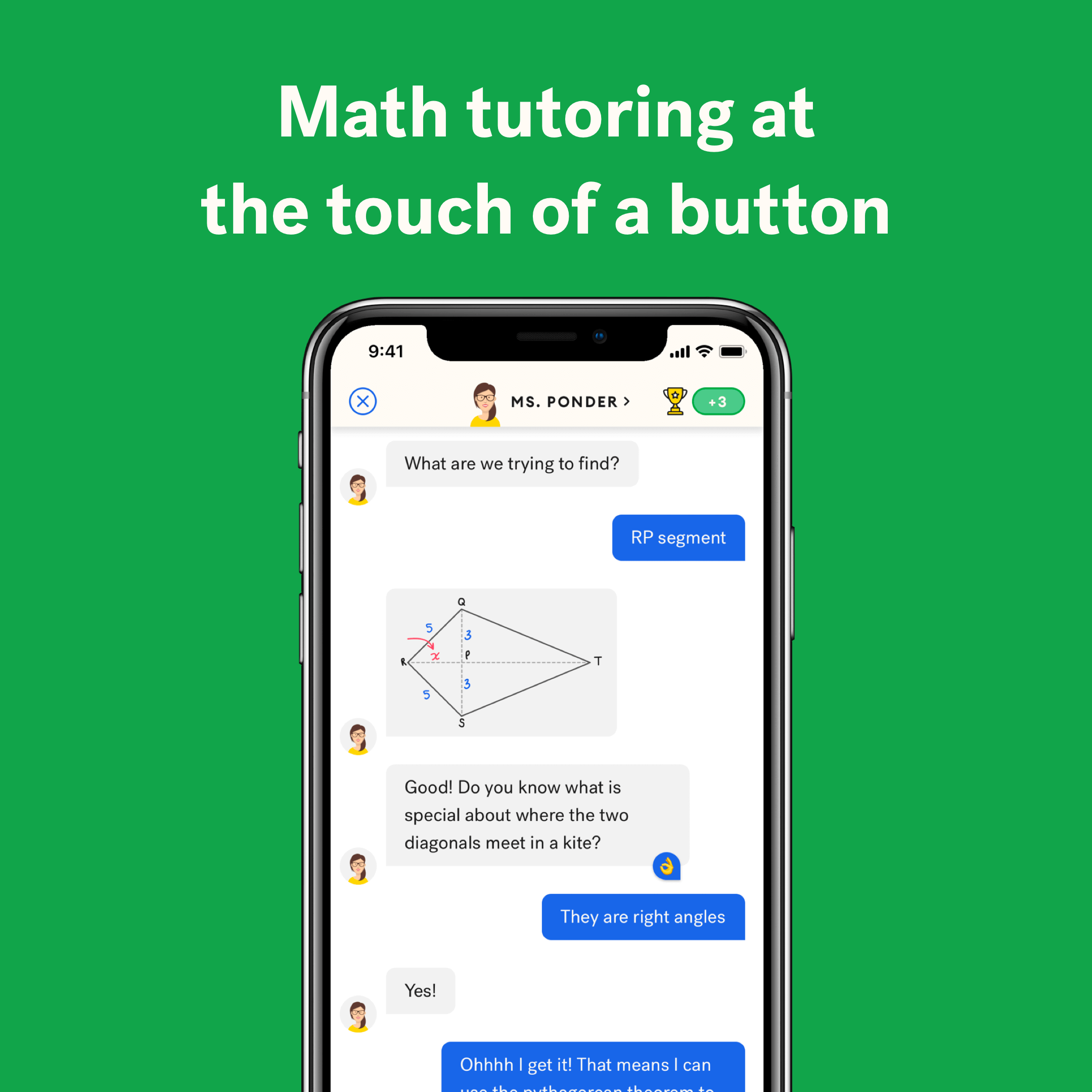
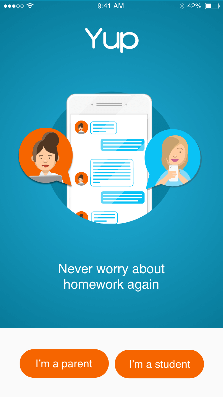
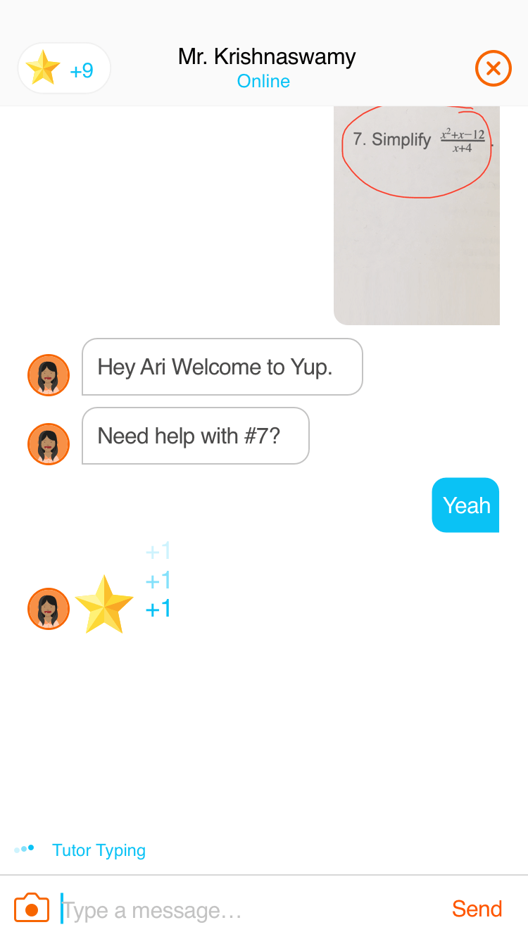
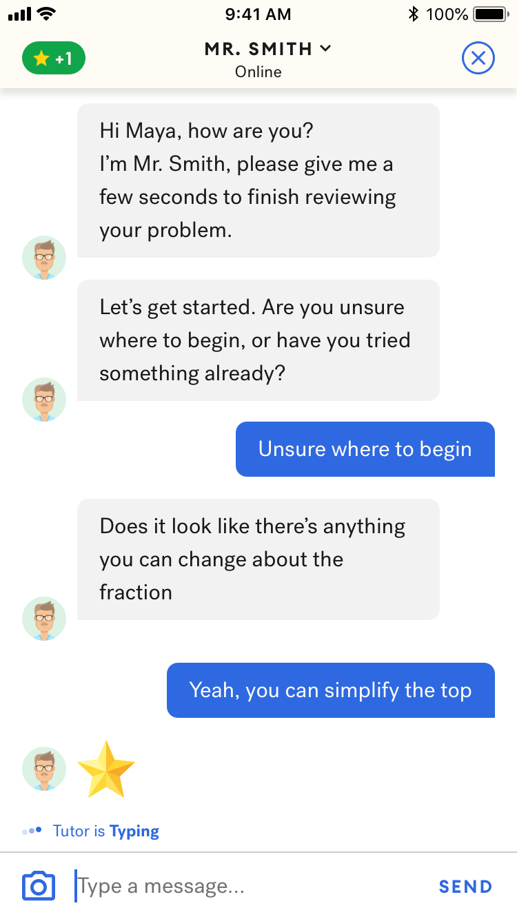
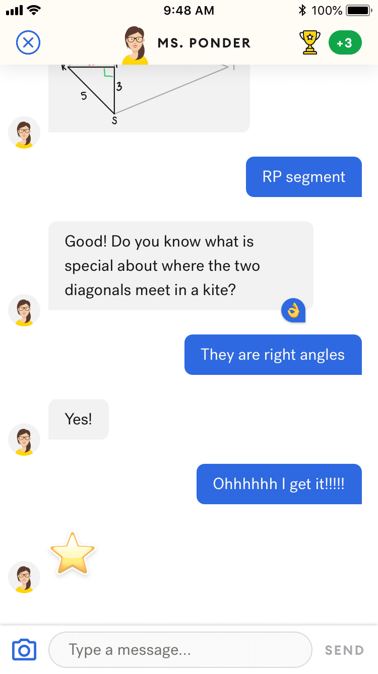
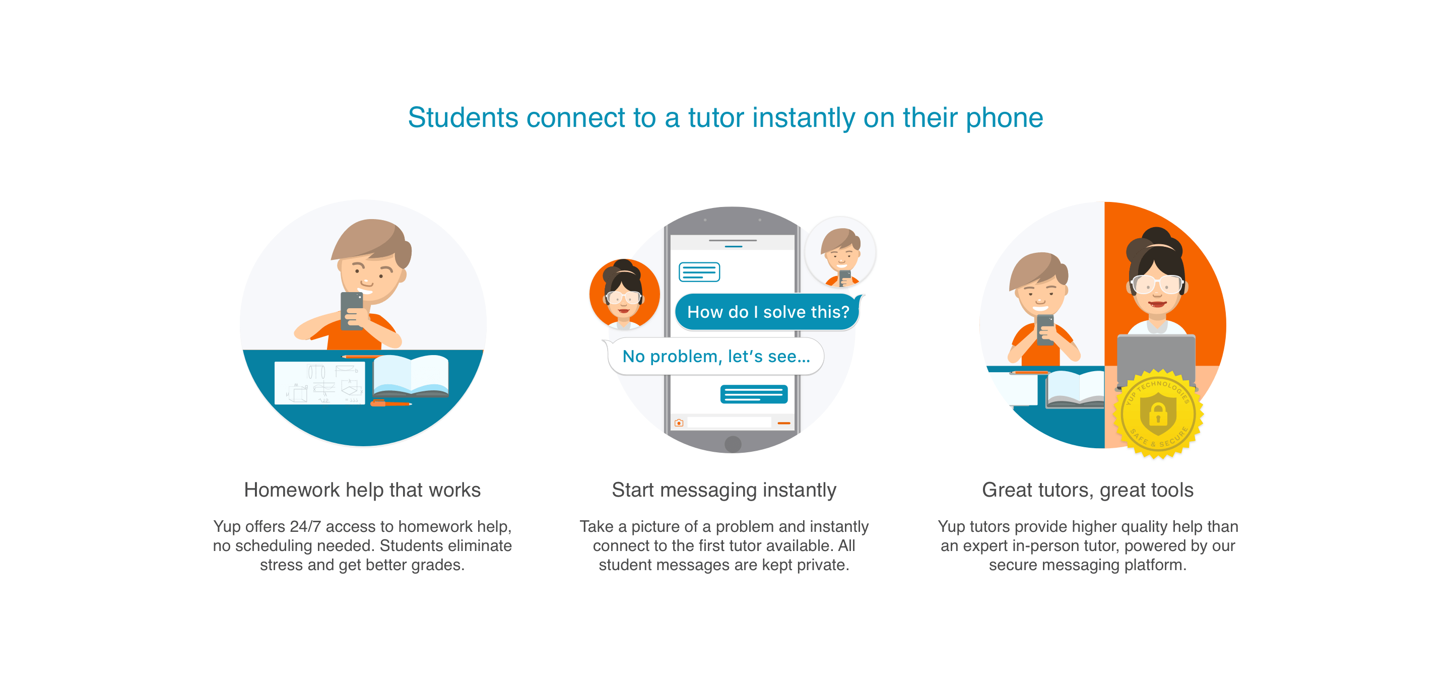
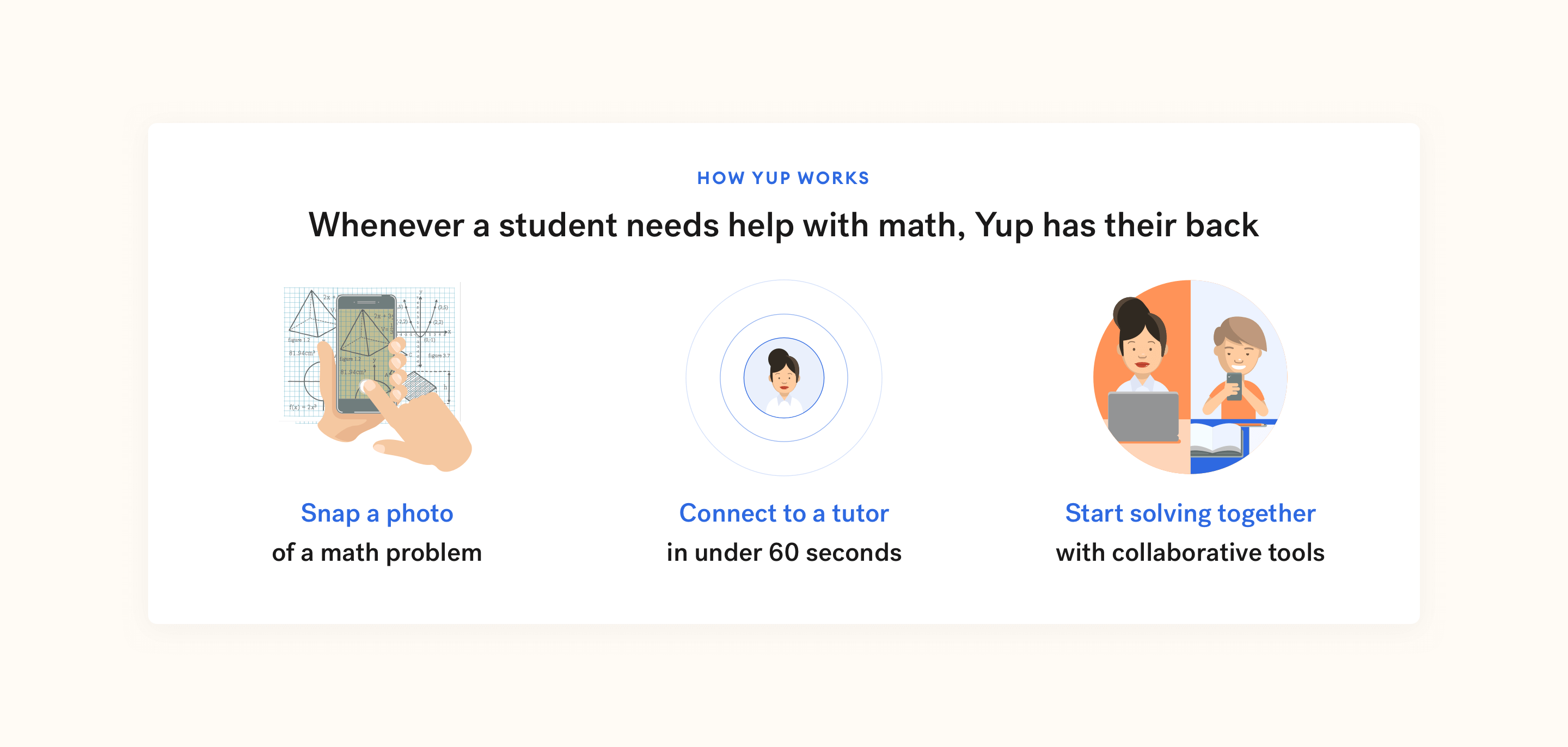
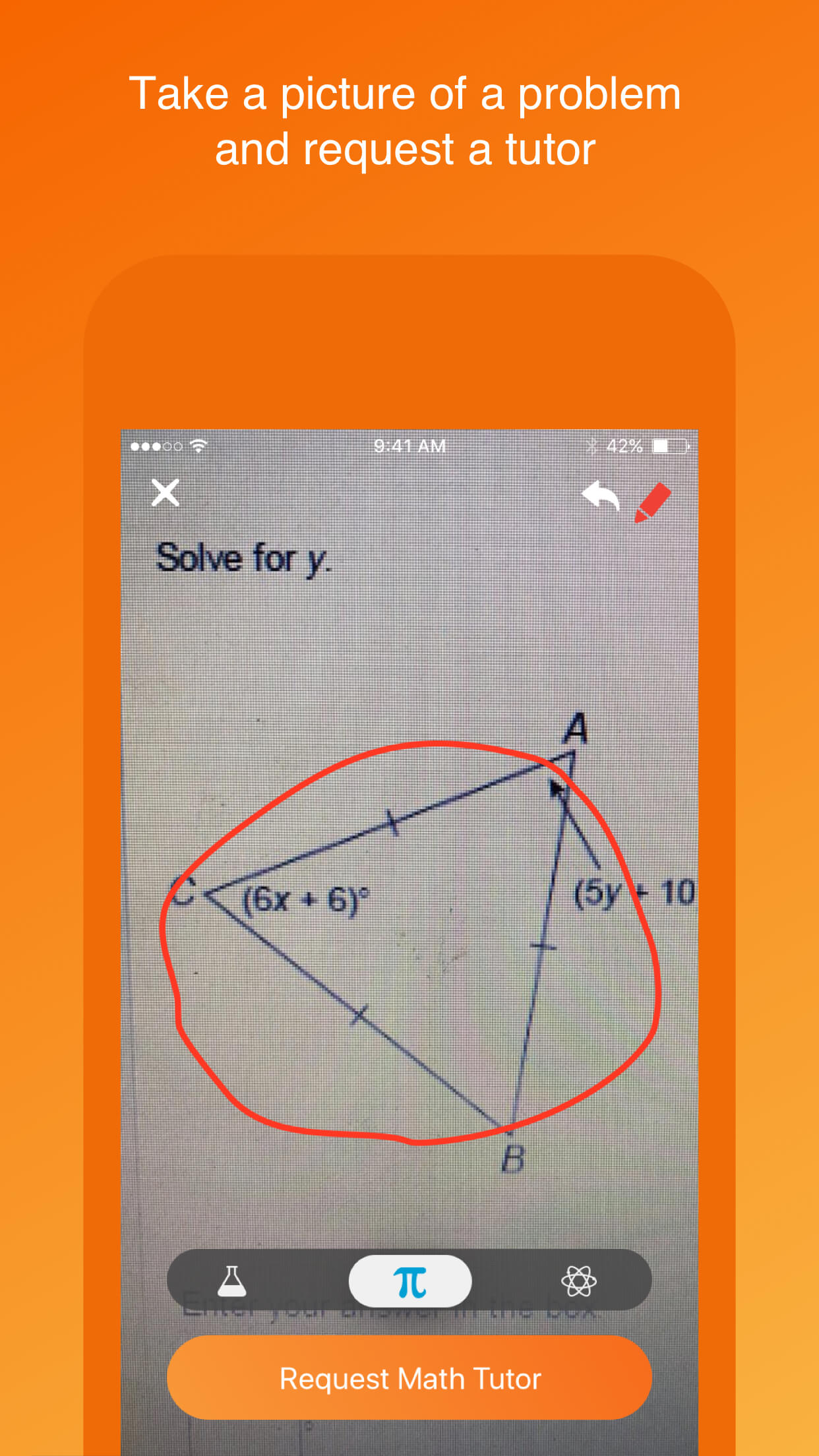
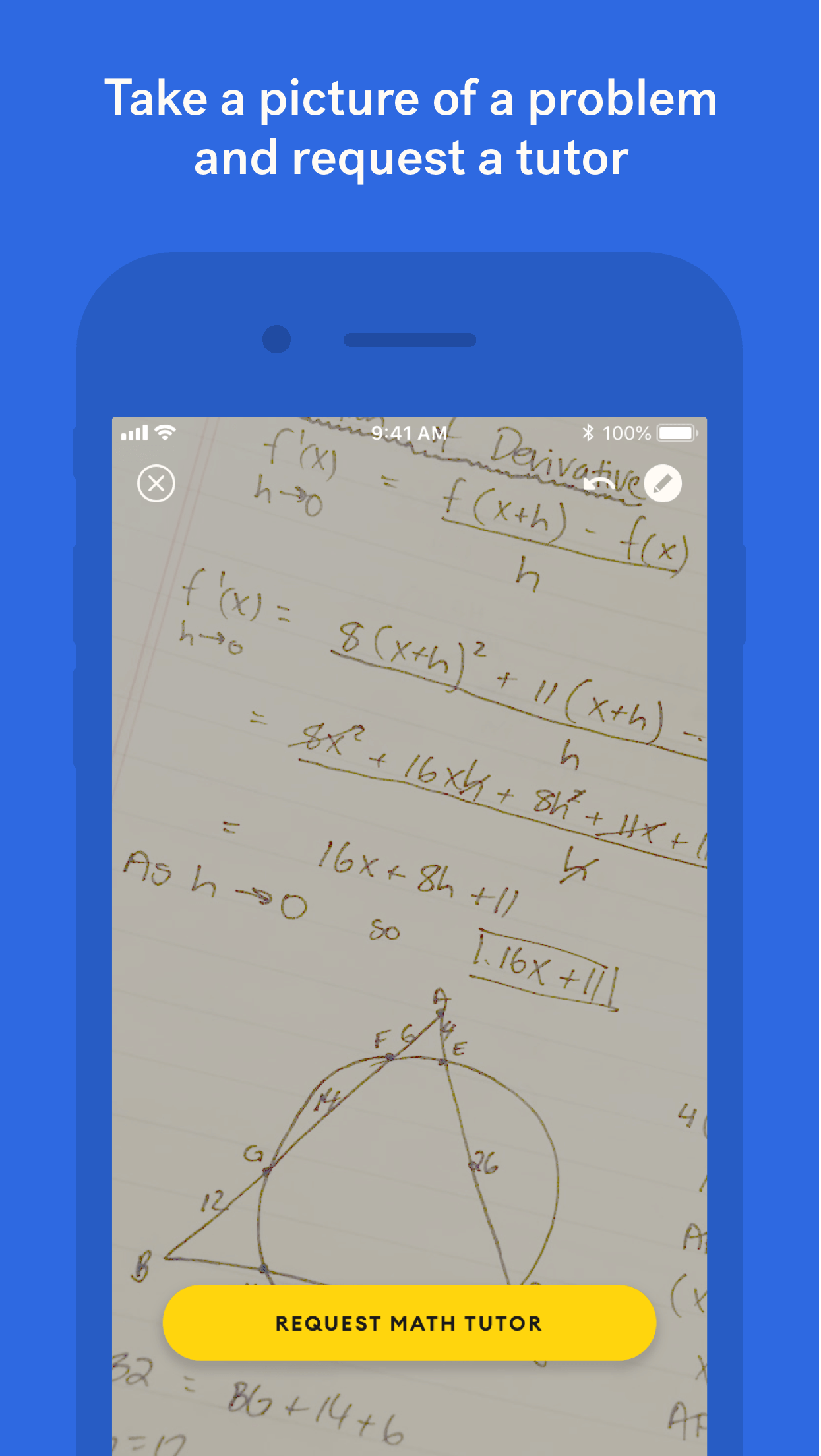
Yup gives students 24/7 unlimited access to expert tutors for a flat fee and is backed by the biggest names in education. Students snap a photo of a math problem, connect to a tutor in under 60 seconds, and start solving together with collaborative tools.
- Product Design for iOS, Android, and Webapp
- Design System
- Full Rebrand
- Digital, Print, and TV Marketing
My Role
As Yup's Head of Design, I lead product design for the Yup iOS, Android, and web apps, working closely with the Product, Customer Success, Engineering, Tutor Operations, and Growth teams.
Projects
Since starting at Yup 1 year and 8 months ago, I have worked on 106 feature tickets with the Product and Engineering teams, designed hundreds of pieces of brand collateral for the Customer Success, Growth, and Sales teams, and collaborated with Engineering to start a design system from scratch.
Continue reading to dive into some of my favorite projects, or select a project to jump to below:
Product Features
- Family Portal (Webapp)
- Favorite Tutors (iOS, Android, Webapp)
Brand Work
- Printables for Customer Success
- App Store Screenshots
- UI Animations
- Graphic Direction for Videos and TV Spots
- Creative Framework
- Art Direction for Animations
- Advertisements
Other Projects
- The Rebrand
- The Design System, yup-ui
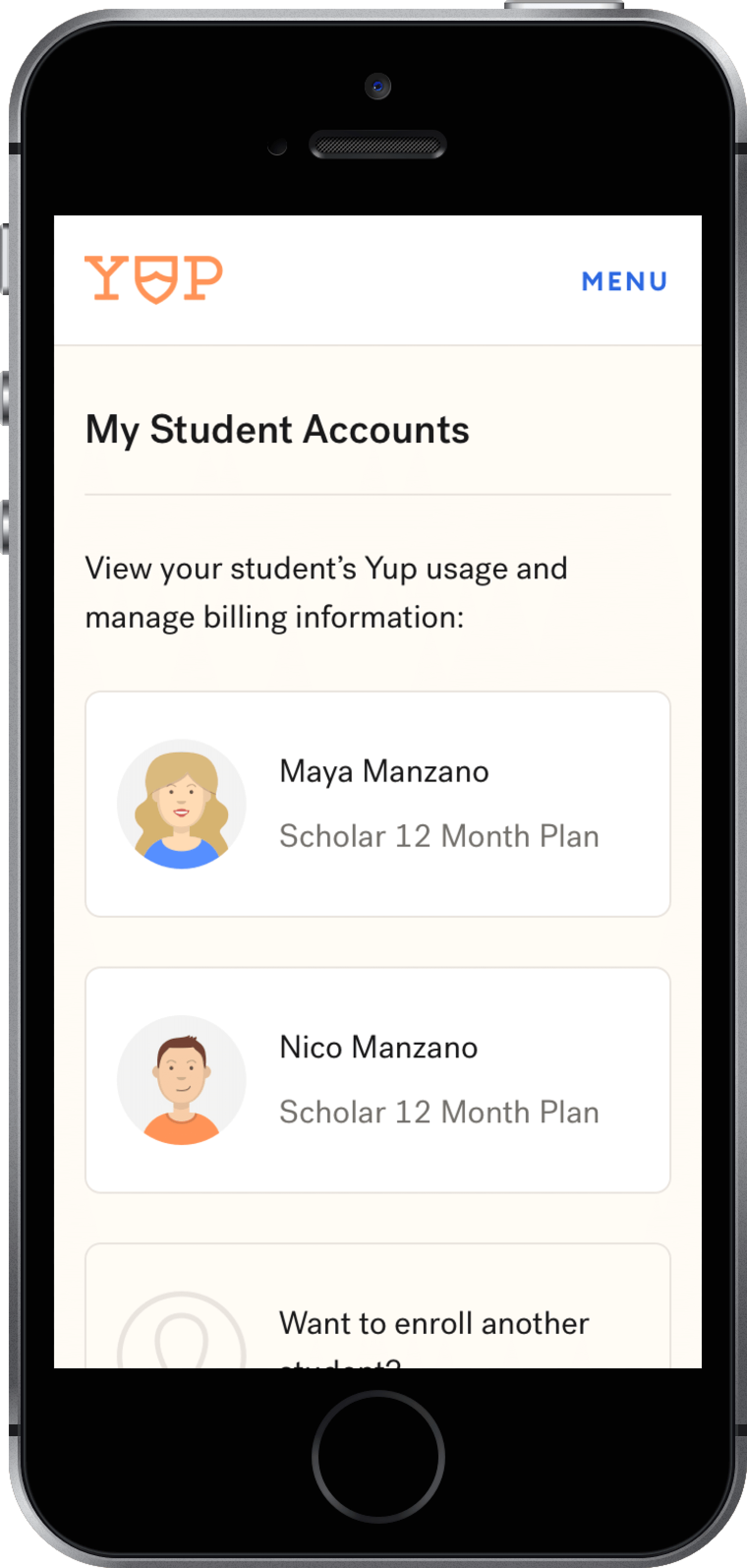
Family Portal
Context & Problem
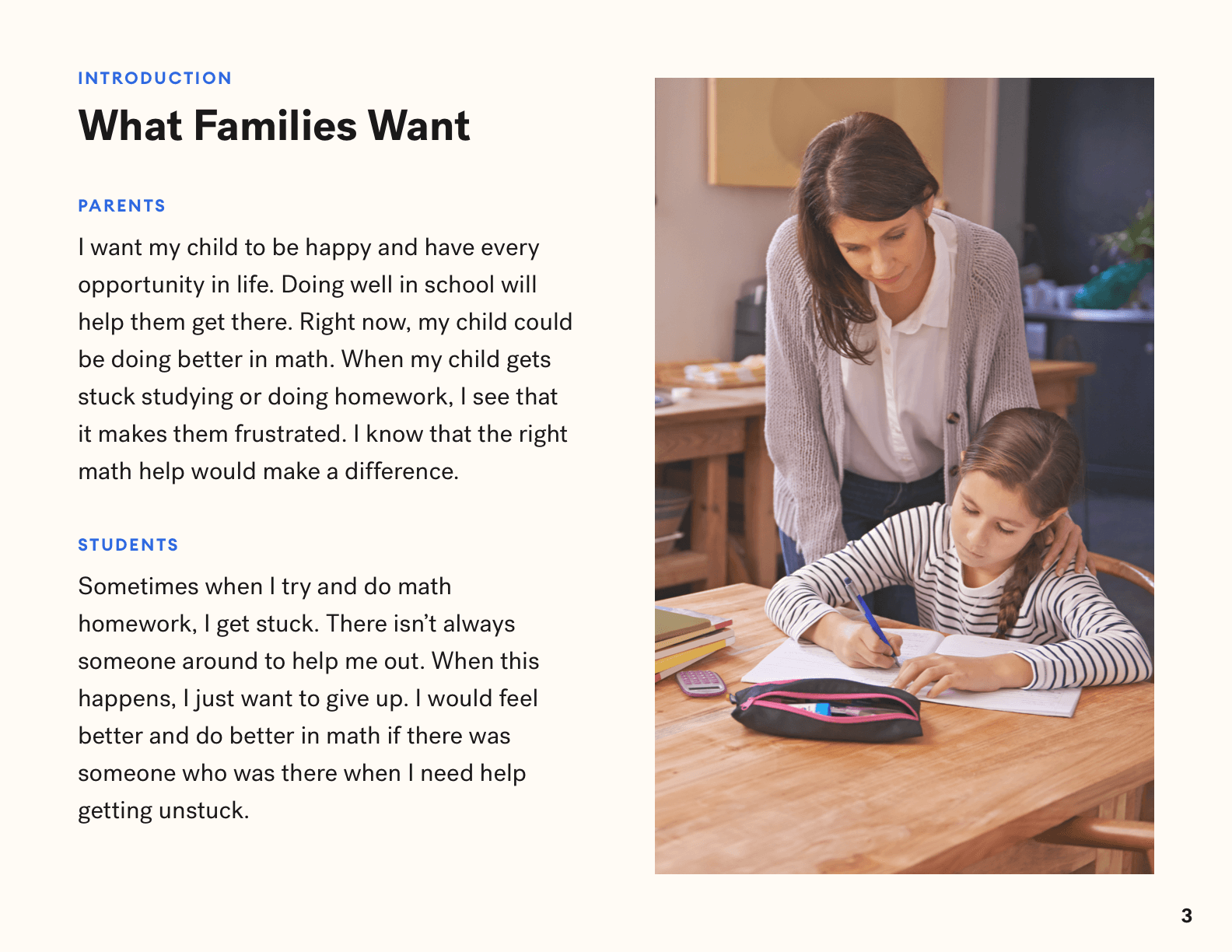
While students were able to review their past tutoring sessions via the app's History screen, Yup's Customer Success team was constantly fielding requests from parents who also wanted to access their student's Yup sessions and monitor their usage.
I want to be able to check on his progress on my phone or computer. Can I do that?
I am a parent and want to be able to view how much my son is using the app. How would I do that?
Without a dedicated app or portal for parents to use, Customer Success directed parents who wanted to view their child's Yup usage to log in to the student app using their child's phone number — a workaround which, while functional, left many parents confused:
How can I access my child's account on my phone? I dowloaded the app but it didn't recognized me as a parent.
I downloaded the app, but I think I am seeing the same thing my son sees.... the app is addressing me like I am a student...
Do I log in with her phone #? If so, I tried that, but it sent a verification code to her phone, not mine. Am I doing this wrong?
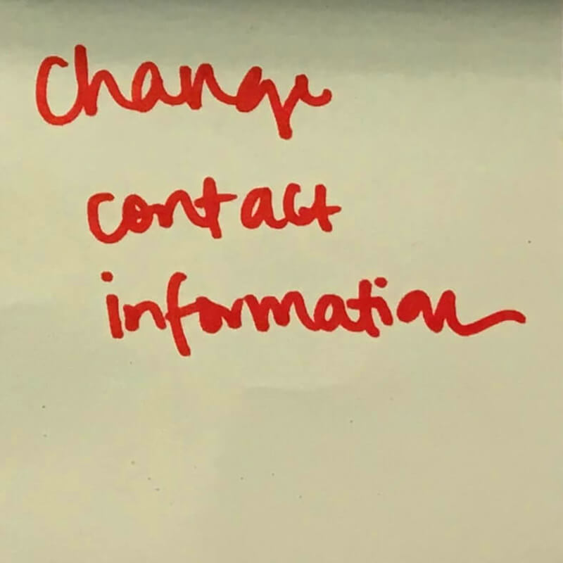
The CS team also received a number of requests from parents and students who wanted to edit their account information:
Hi, I would like to change my yup name and phon number.
I need to have our YUP account changed to a new cell phone number.
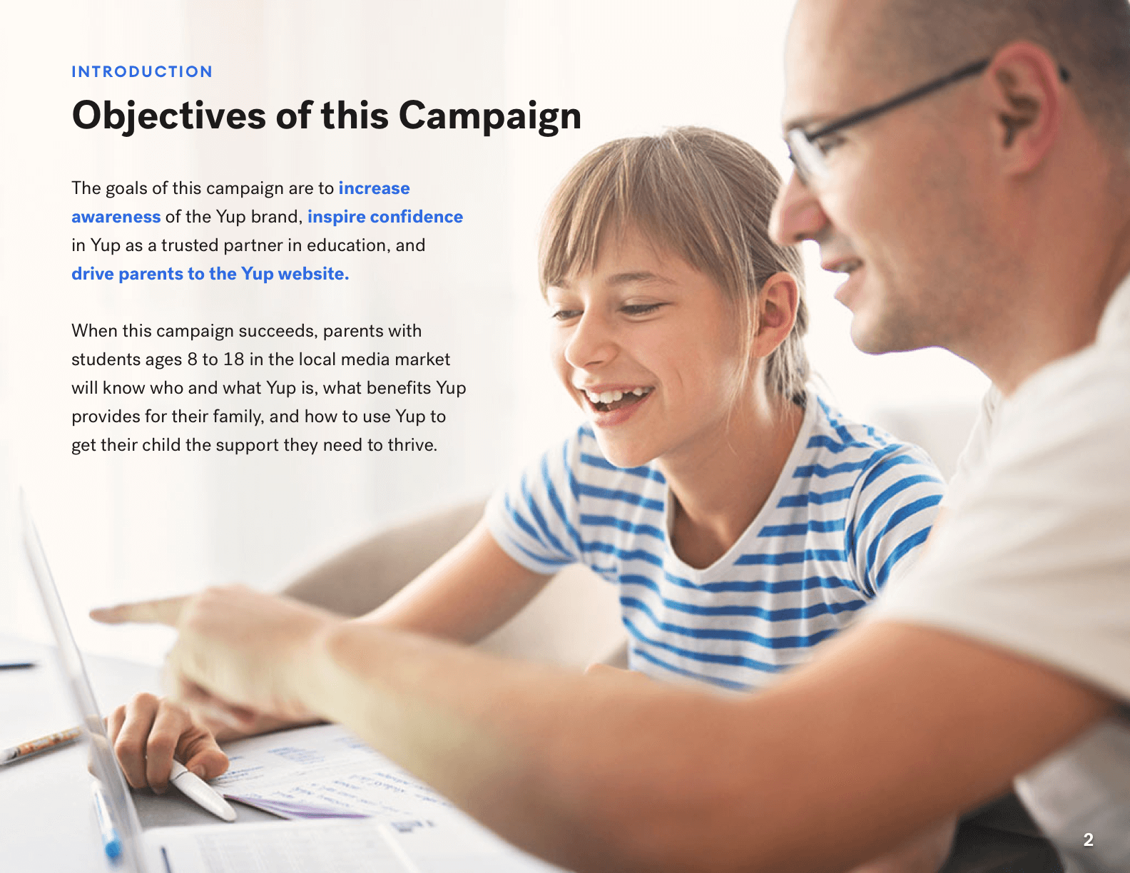
Goals
- Increase transparency by giving parents insight into their students’ Yup usage without relying on confusing workarounds
- Match expectations set by sales pitches, a high product price point, and industry standards
- Free up the Customer Success team's time by providing parents with access to support resources, student data, and account management tools
Defining MVP Requirements
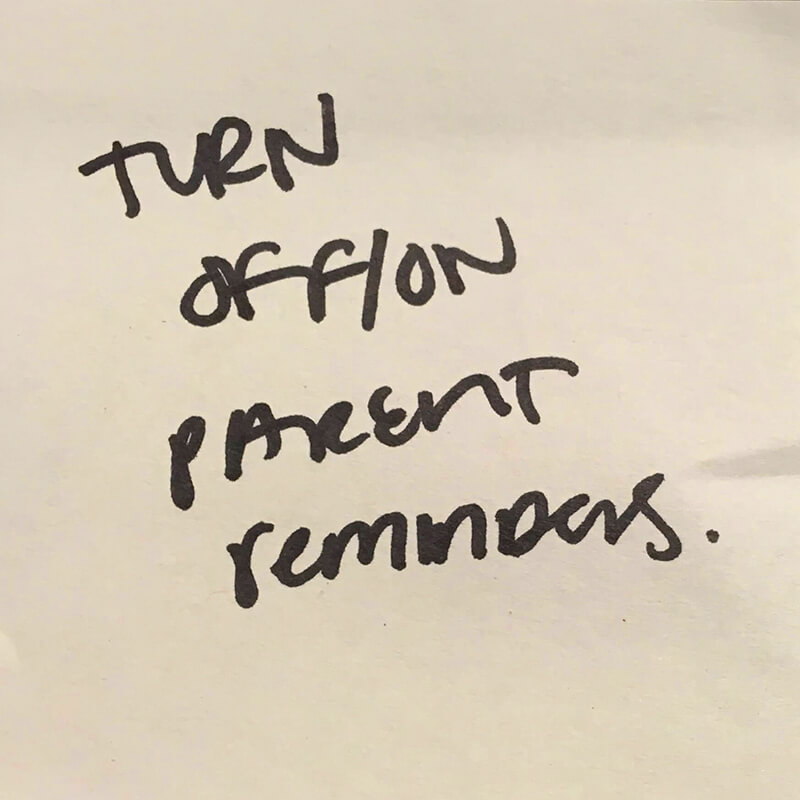
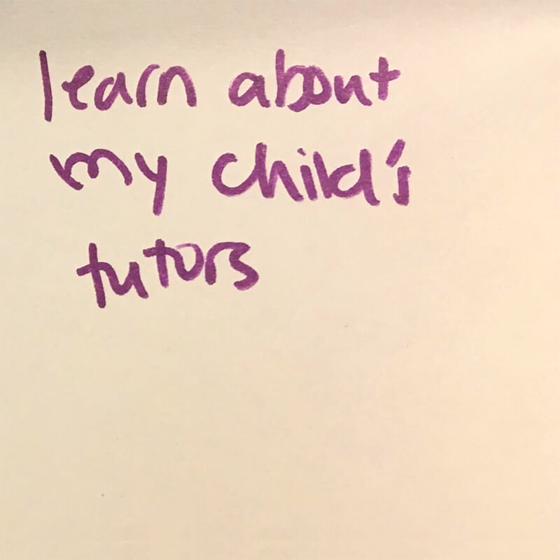
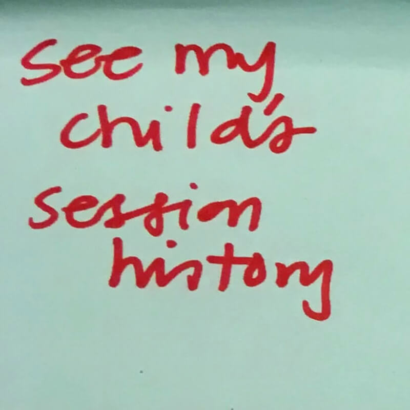
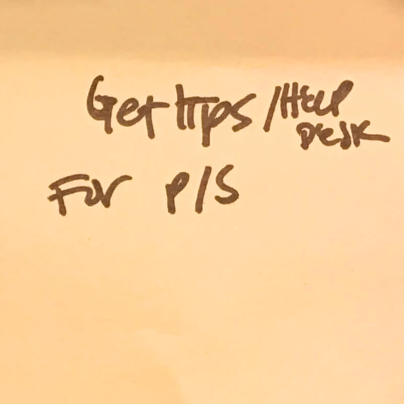
Ideation
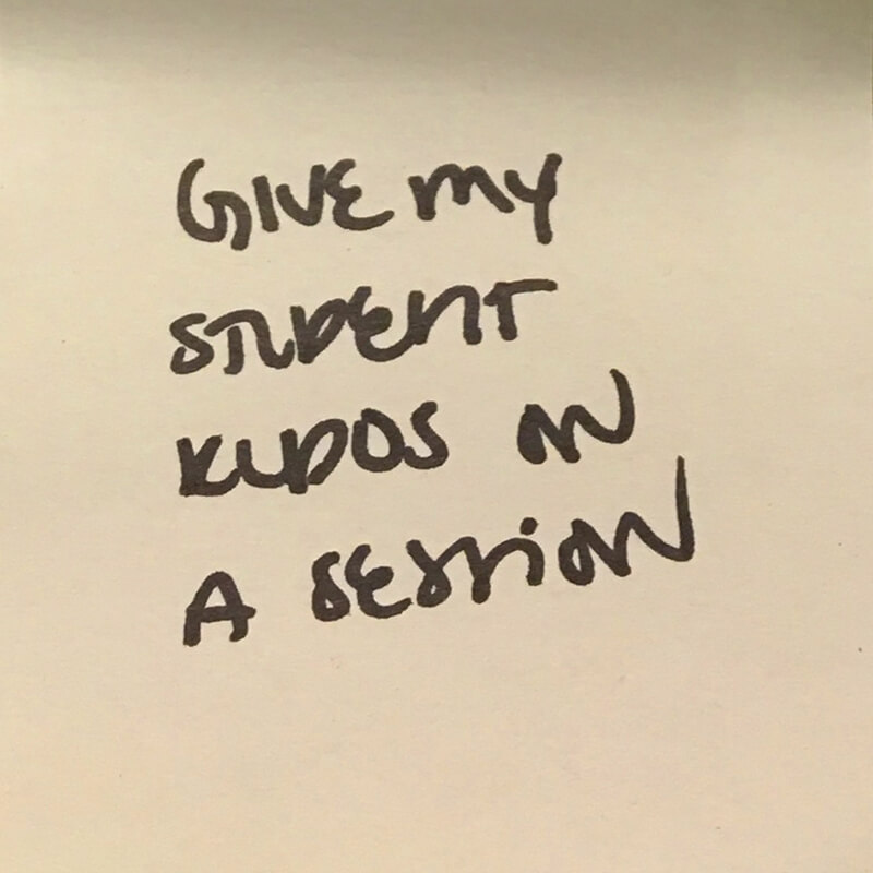
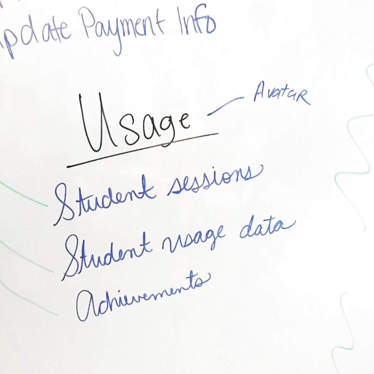
In an ideation session with the Product and Customer Success departments, my teammates and I completed the sentence stem, "As a parent, I can…” based on feedback and specific requests from parents.
We jotted ~70 ideas down on Post-It notes, including the ones below:
Next, we presented our user stories and clustered together Post-Its that referred to the same user story. After clustering, we were left with 45 unique potential requirements. I transferred these to a spreadsheet and categorized them for easier tracking.
Decision
After a discussion between the CEO, Director of Product, Director of Engineering, and myself, we decided that the Family Portal MVP would include only the requirements that fell in one of the following buckets:
With this business constraint in mind, Ari (our Director of Product) and I voted on whether each requirement should be included in the Family Portal MVP. When voting, we considered a number of questions, including:
- How often has this requirement been requested by parents?
- For account management requirements – how much time does CS spend doing this manually? Would parents rather do it themselves?
- For this requirement to be built, would we need to make changes to other parts of the Yup ecosystem, like updating our mobile apps or changing existing email communication?
We voted "no" on potential requirements that did not directly relate to existing Yup features, required updates to other parts of the ecosystem, or were related to existing Yup features that had low usage. In instances when we disagreed or did not have enough information to make a confident vote, we discussed with each other and Jen (our Director of Customer Success) until we'd reached an informed consensus.
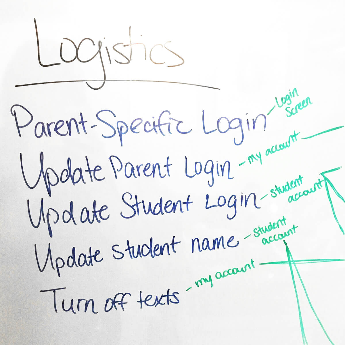
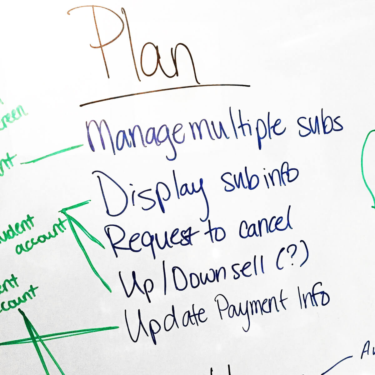
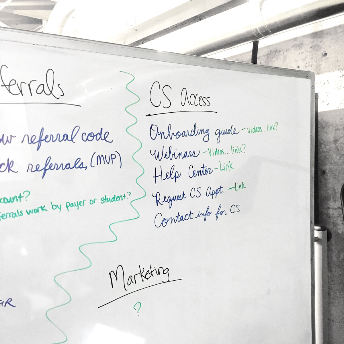
After this paring down process, we were left with 19 feature requirements. I added some thoughts about information architecture and potential UI implementations before bringing the list back to our CEO and Director of Customer Success for signoff and feedback. Some of the list is shown below:
| Category | IA | Req Name | As a parent, I can… | UI Ideas |
|---|---|---|---|---|
| Logistics | Login | Parent-Specific Login | sign in with my own email or phone number | Brand new parent login screen |
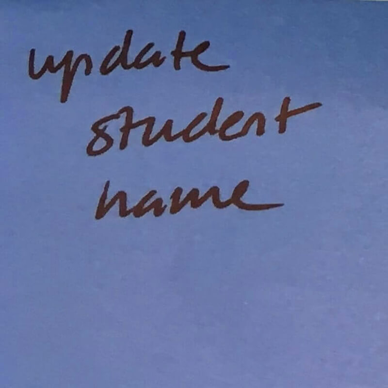
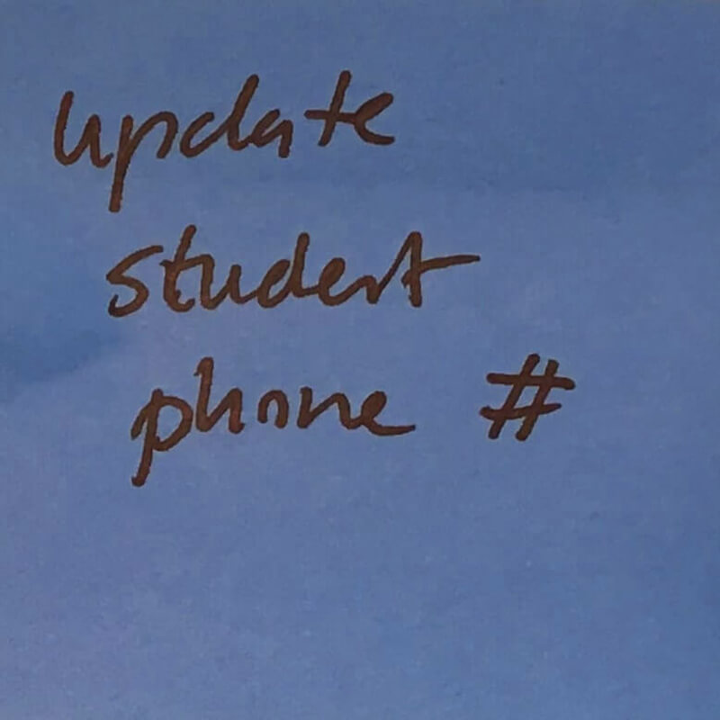
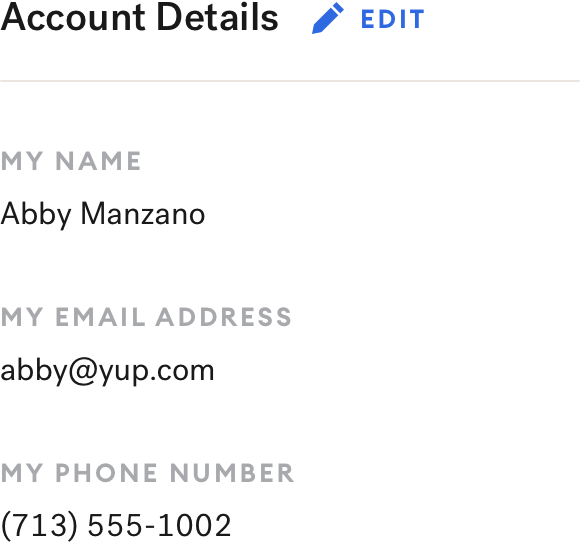
| Logistics | Parent's Account | Update Parent Creds | update my email and phone # | Editable text fields |
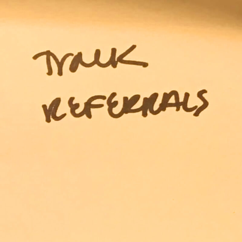
| Referrals | Parent's Account | Track Referrals | track my referrals | Display $ off, like app |
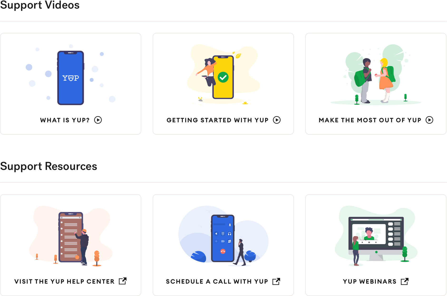
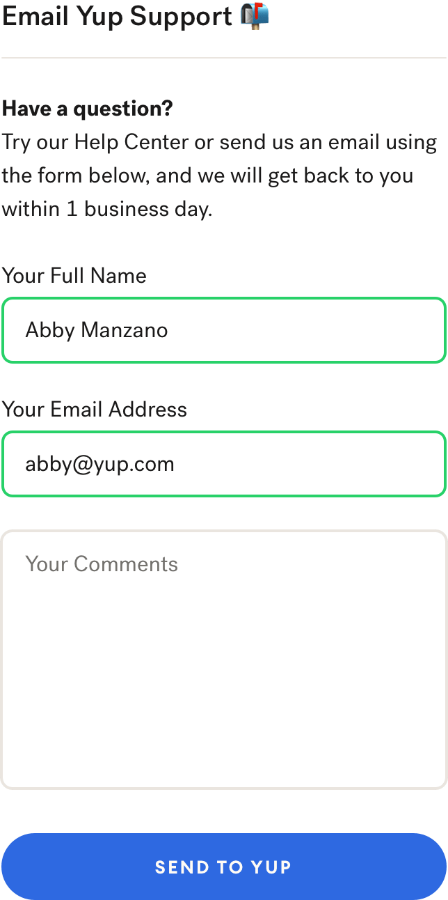
| CS Access | Yup Support | Contact CS | send a message to Yup support | Contact form from our website |
| CS Access | Yup Support | Help Center | access help/FAQs | Styled buttons to static resources |
| Plan | Student's Account | Request to Cancel | cancel my subscription | mailto: link like app |
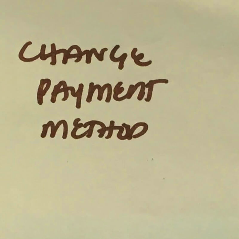
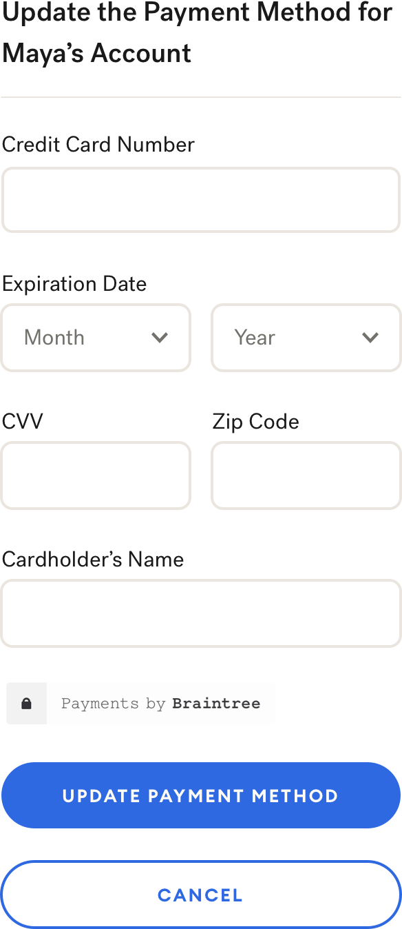
| Plan | Student's Account | Change Payment Info | change my payment info | Same form as app |
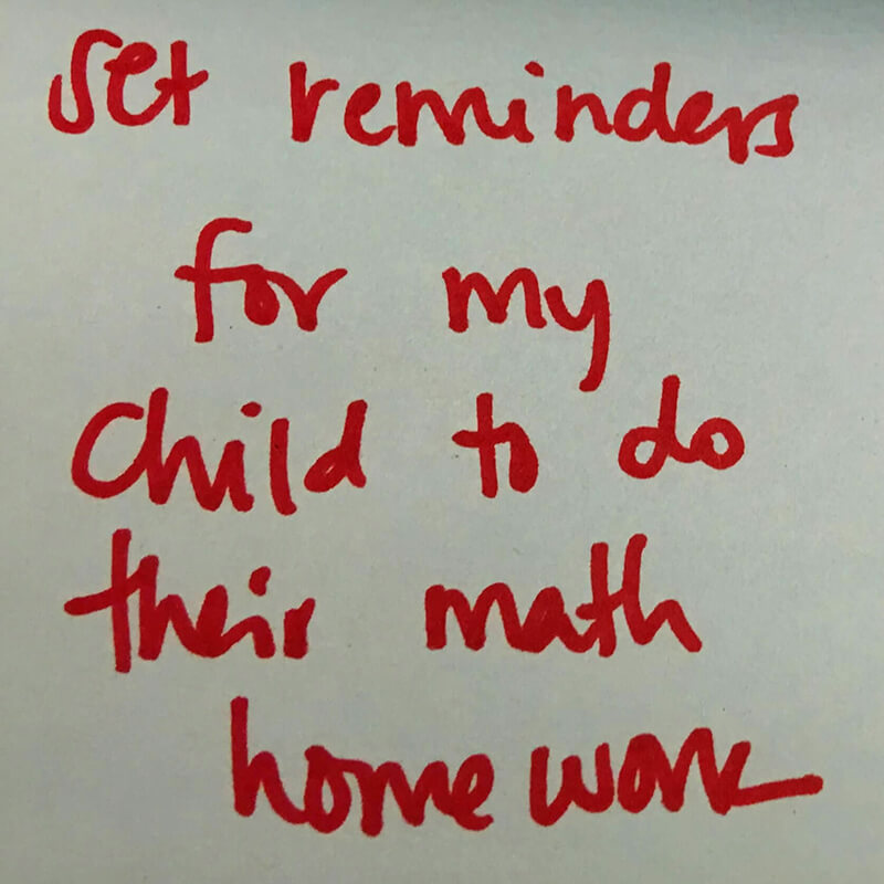
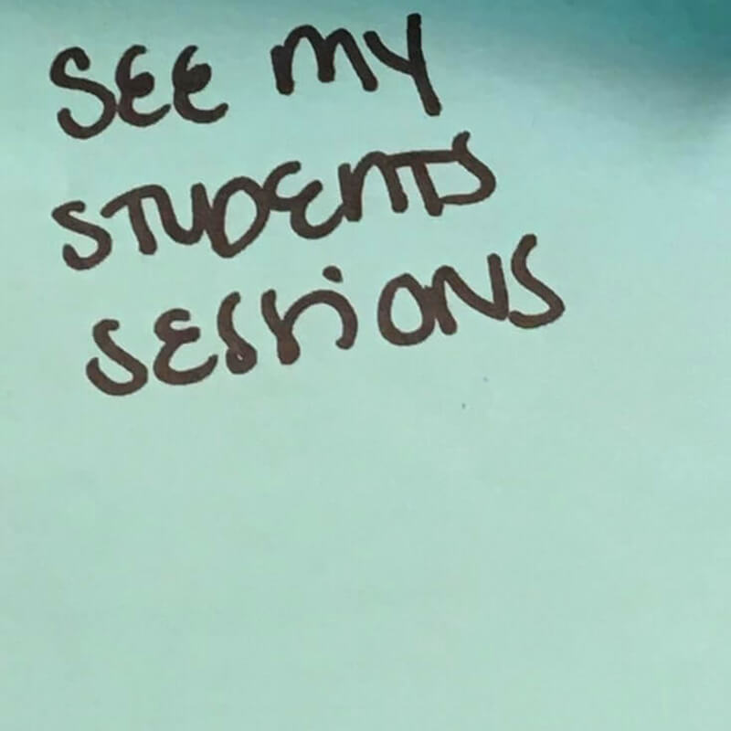
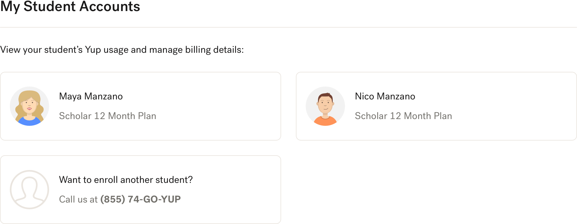
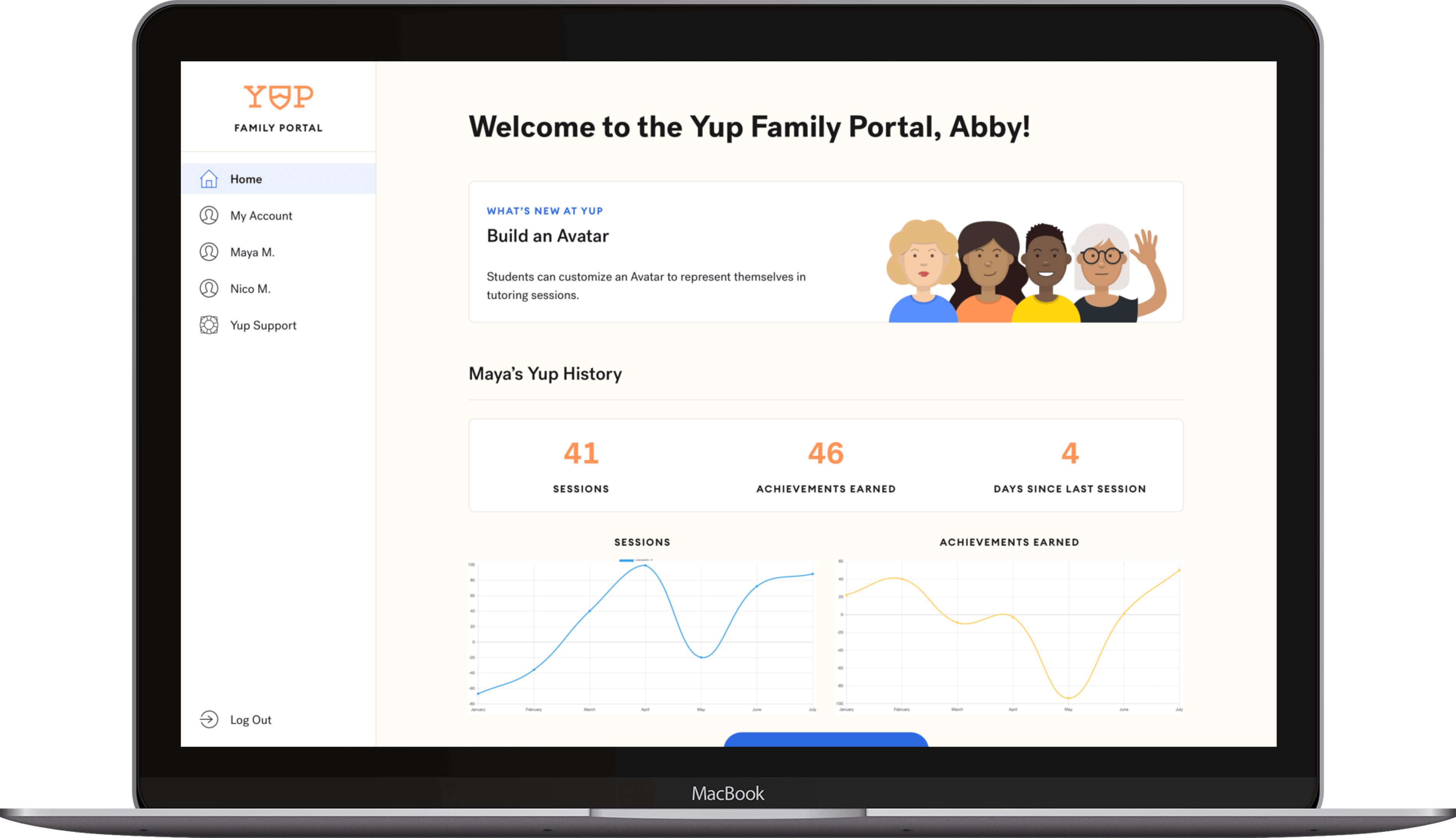
| Usage | Student's Account | Session Transcripts | read my student's sessions | Filtered list of session links |
| Usage | Student's Account | Usage Stats | see how much my student is using Yup | Charts and high-level stats |
The Design Process
With the team's signoff on the list of requirements, I moved on to design. I started by grouping related requirements together and noting connections:
Through this exercise (and feedback from our Product and Customer Success teams), I formed an initial plan for Family Portal's information architecture and moved on to wireframing.
For wireframing, I used action blocks and content blocks to represent the UI components that would fulfill each of the 19 requirements. These blocks were represented with paper prototyping pieces, which enabled me to easily move them around.
- Action blocks represented the primary UI components of interactive requirements, e.g. change payment info and update parent creds.
- Content blocks represented the primary UI components of content-display requirements, e.g. help center and usage stats.
After feedback from our Product and Customer Success teams, I defined sub-requirements for each requirement (e.g. to change payment info, we need to collect cardholder name, card number, billing address, ZIP, and CVV). Next, I started on high-fidelity designs by defining a layout grid and navigation structure (which we later reused for two other projects). With my site skeleton and navigation in place, I translated each action block and content block into high-fidelity components from yup-ui, my design system.
With the list of feature requirements that hadn't made the cut for the MVP in mind, I sought to make the Portal designs as modular as possible to facilitate the addiiton of future requirements. Most components have the same struture: heading, info (optional), action:
To see the components together, browse the Sketch prototype.
Outcome
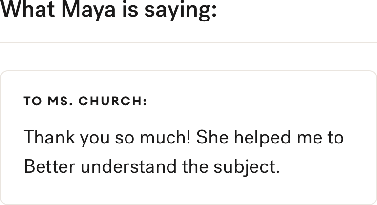
We have not yet run a post-deploy analysis on this feature against its initial goals and metrics, but adoption and engagement signals show parents signing up for, engaging with, and returning to the Family Portal. More details coming soon.
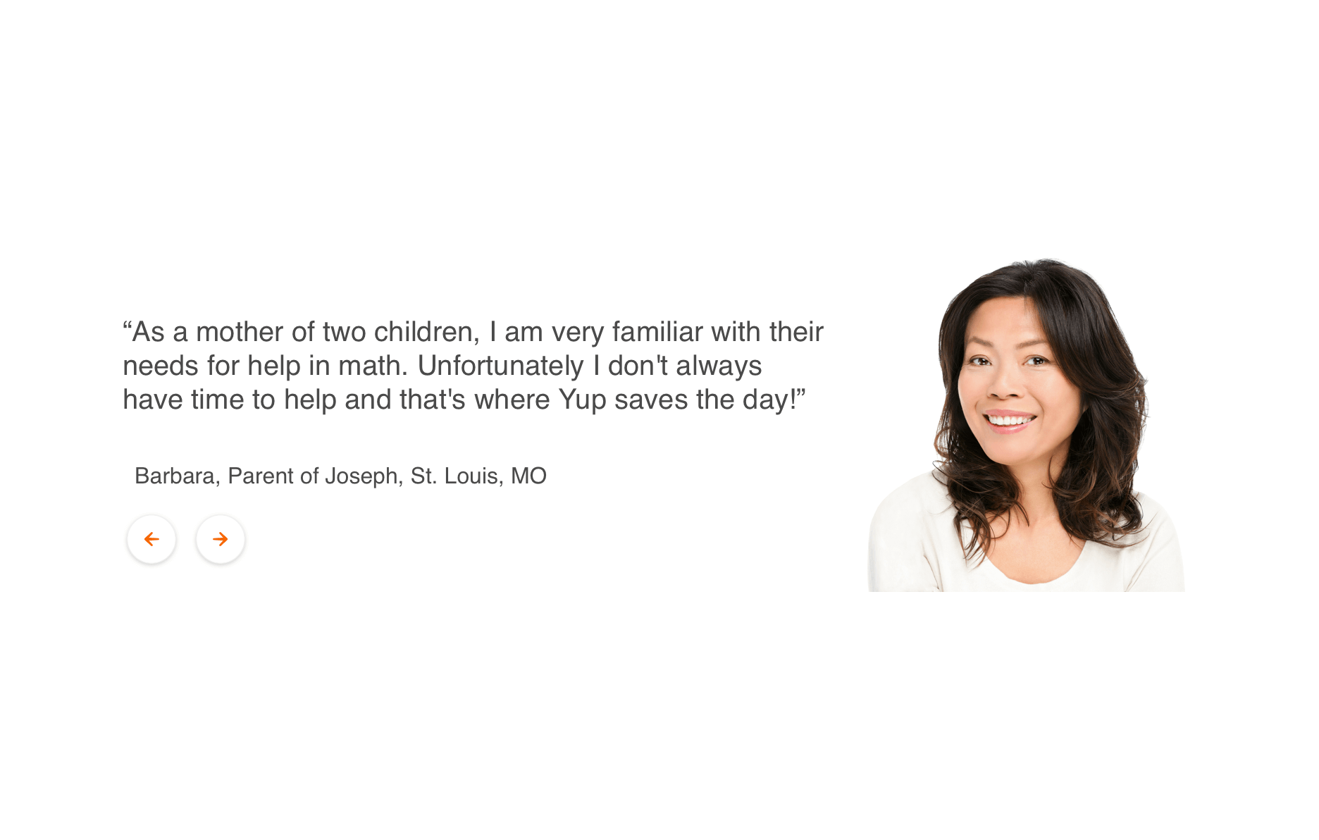
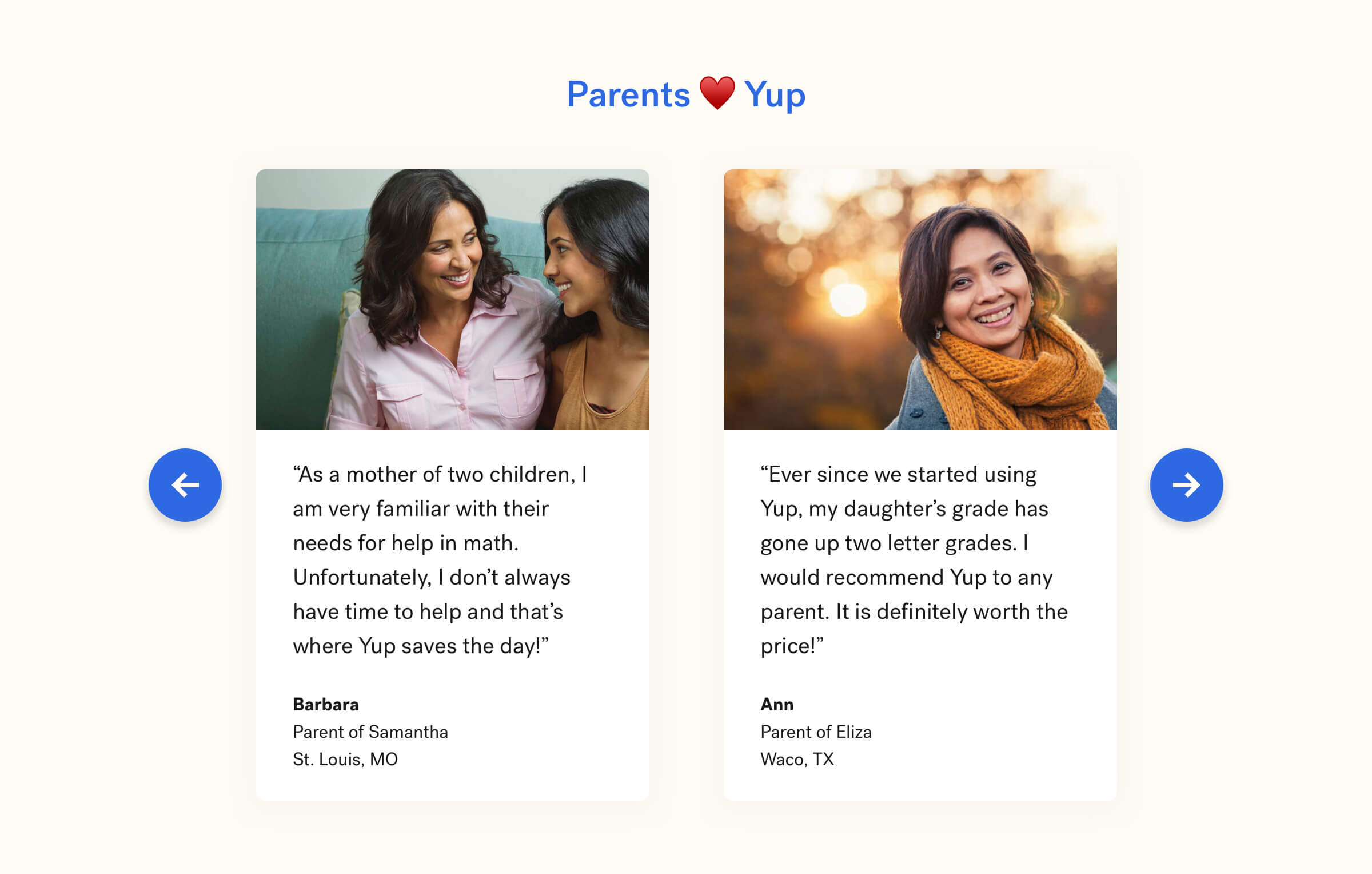
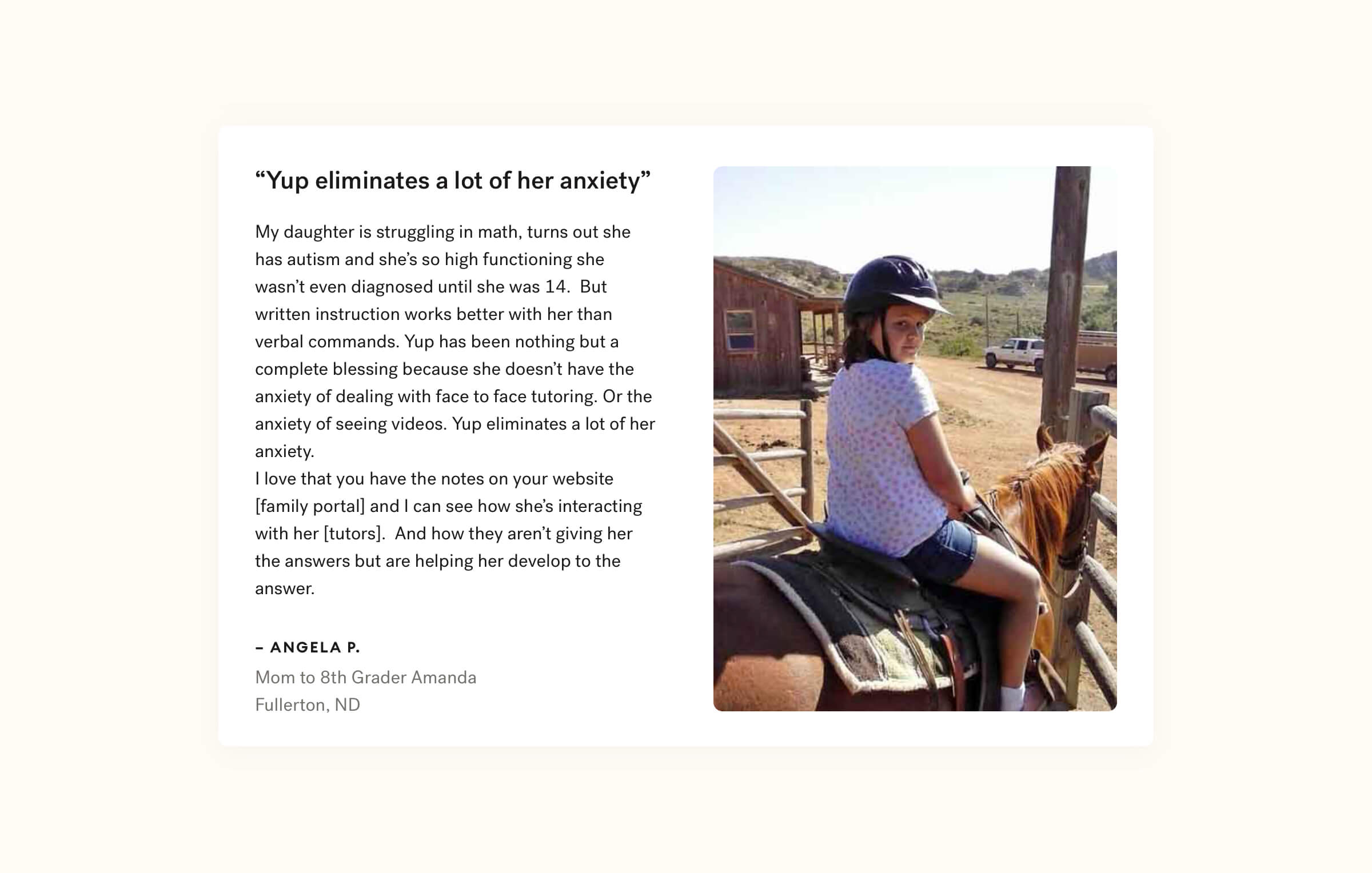
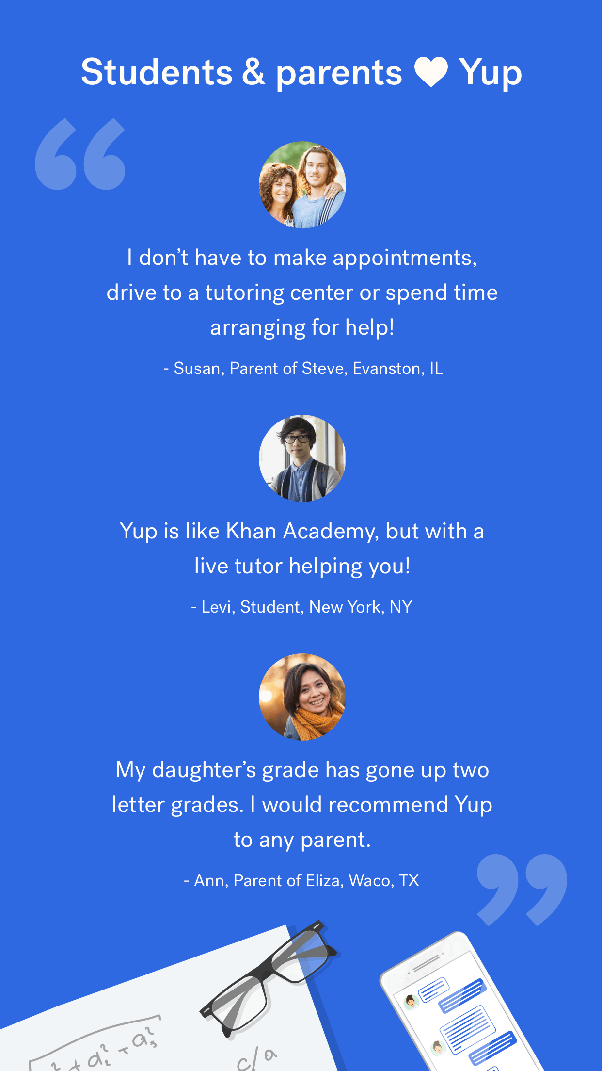
I love that you have the notes on your website and I can see how she’s interacting with her tutors. And how they aren’t giving her the answers but are helping her develop to the answer.
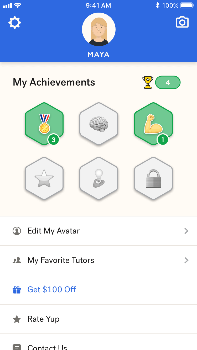
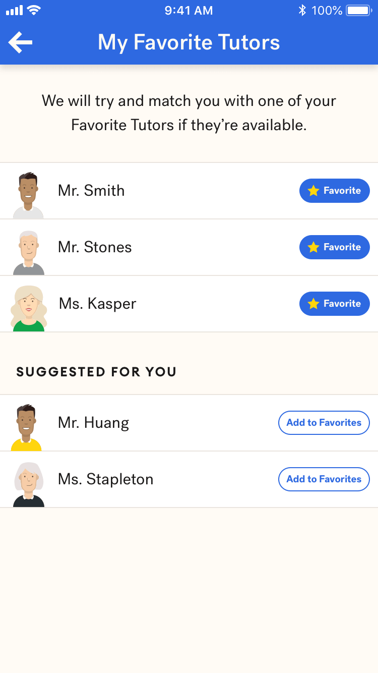
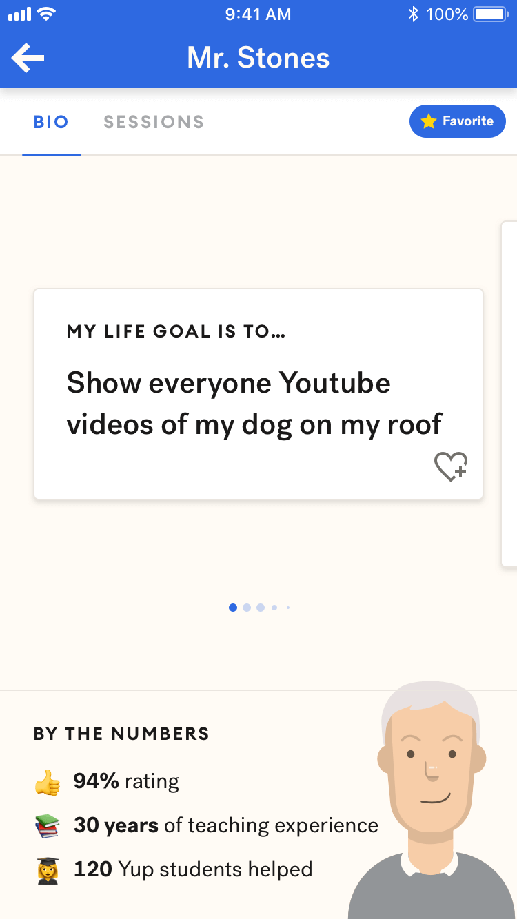
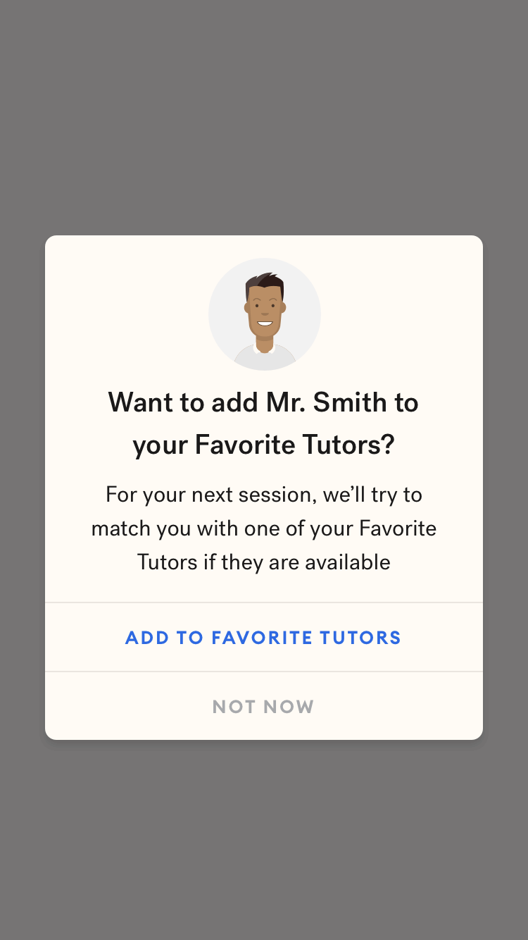
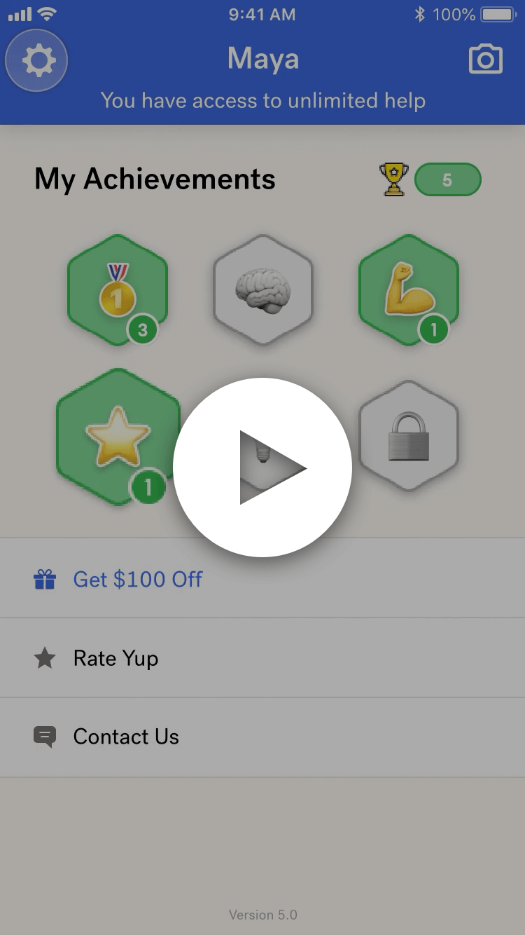
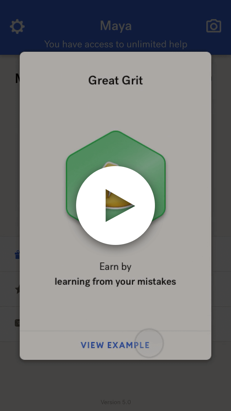
Favorite Tutors
Context
Although all of our tutors are screened for math expertise and teaching skills with a rigorous application process, many students work better with particular tutors. Students have different learning preferences and may respond better to shorter or longer sessions, more or fewer examples, more or fewer images, etc. Students also exhibit preferences for different language styles, for example, casual vs. formal language. Our Customer Success team often receives comments from parents who mention their child's preferences for particular tutors, and Yup students often mention that a particular tutor is their "favorite" in their post-session feedback:
You have been my favorite math tutor yet! Hope to see you again! Love, Maisie
Can you make a way to request a tutor? That would be awesome cause some tutors don't explain everything😪
You have been my favorite tutor thus far! 🙂 thanks again, and I hope I get to work with you an time!
Goals
- Decrease churn by due enabling students and families to build connections with specific tutors
- Improve the student's learning experience by factoring a student's tutor preferences into the matchmaker
Design
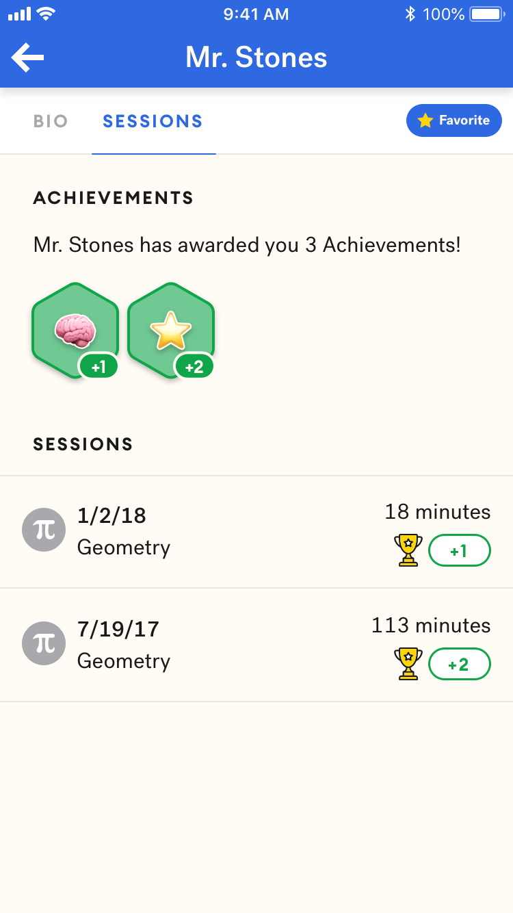
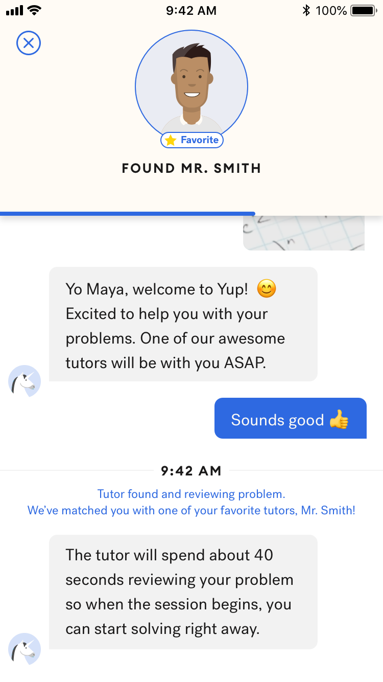
Outcome
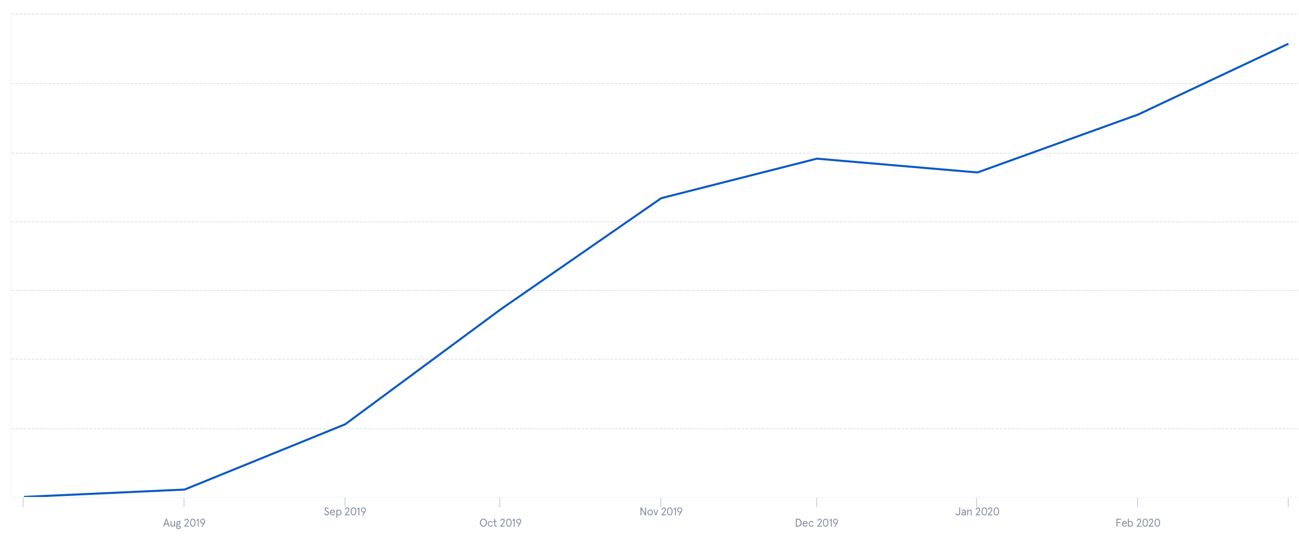
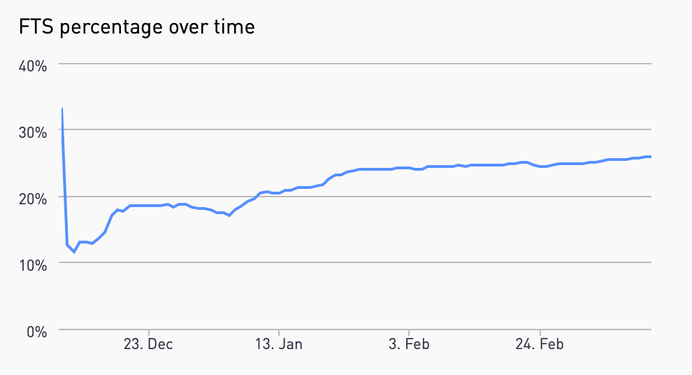
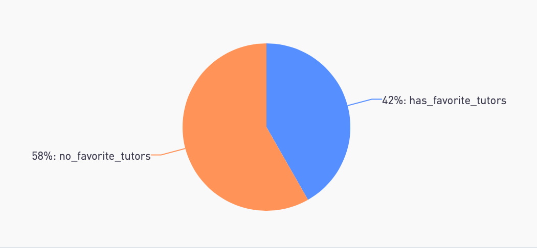
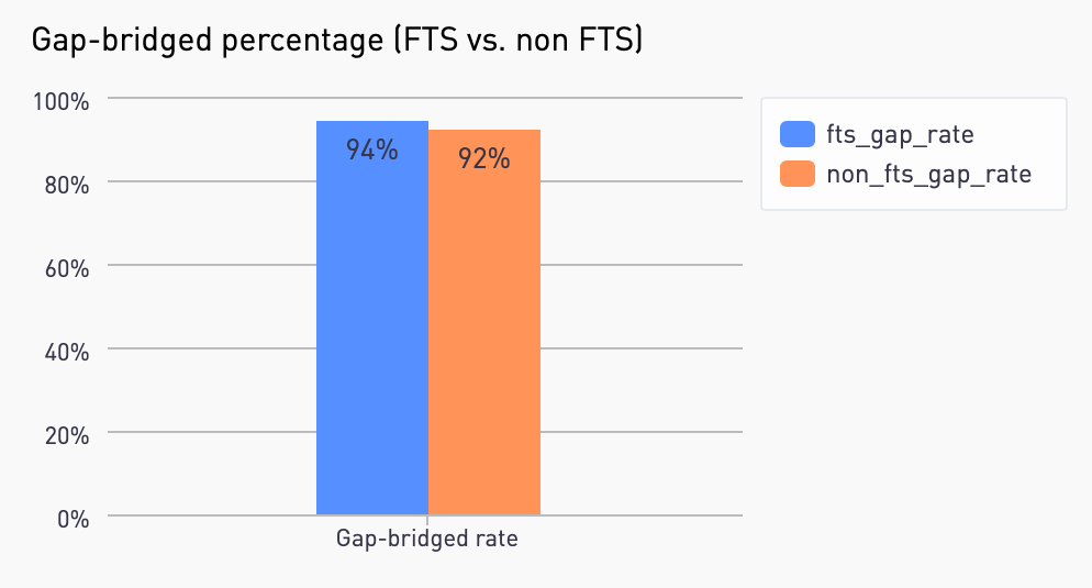
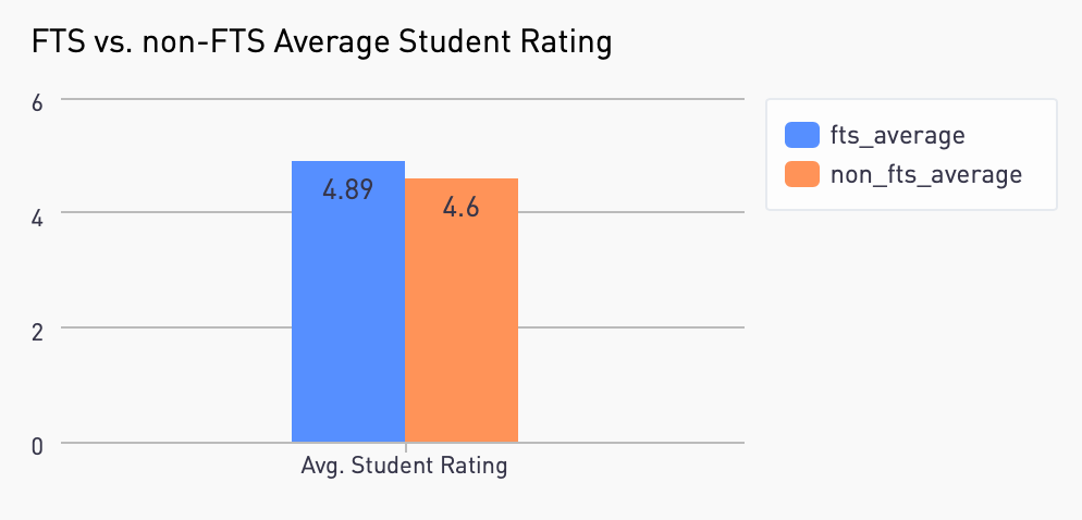
The percentage of Favorite Tutor Sessions (FTS), or sessions that take place between a student and a tutor on their favorites list, has been increasing since launch as more tutors have been added to students' favorites lists. On average, favorite tutor sessions have higher student ratings and are more likely to be "gap-bridged" (indicating improved learning outcomes). More analysis is needed to look beyond correlation, however, as students that add tutors to their favorites list are generally already engaged learners.
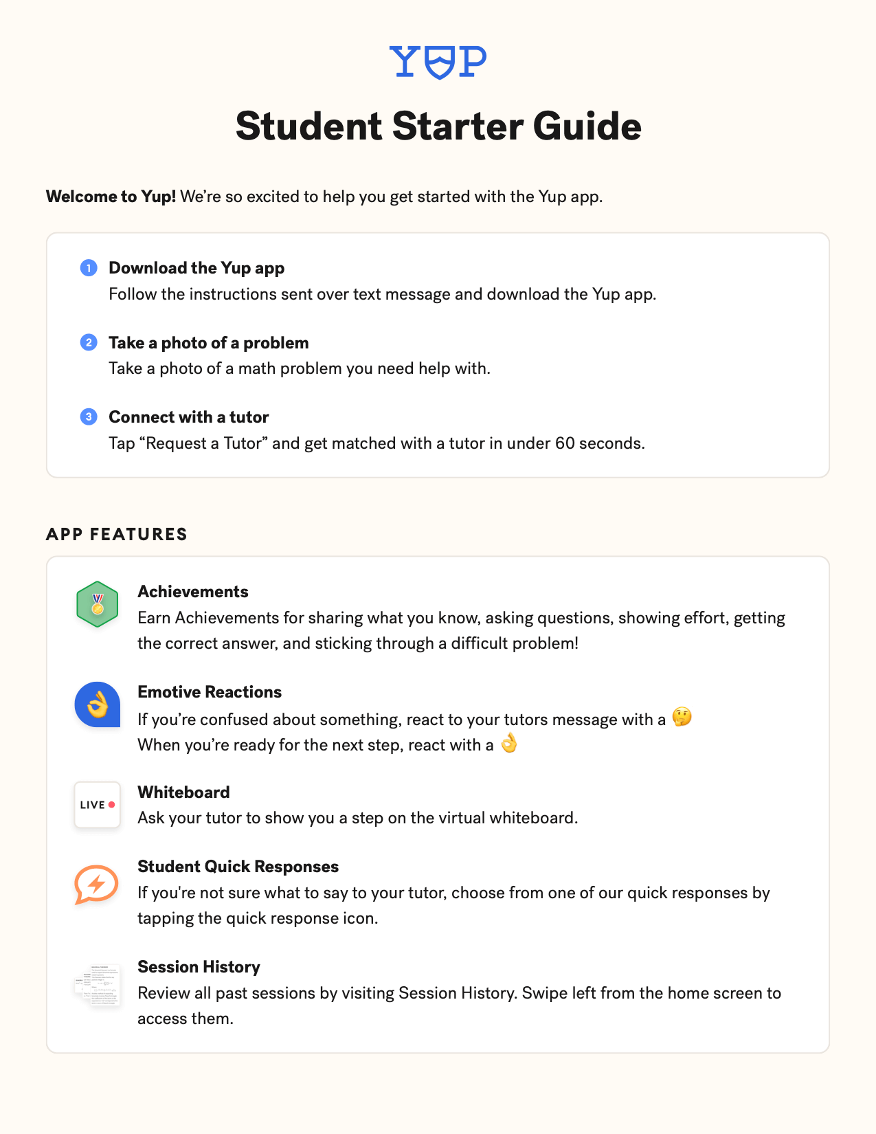
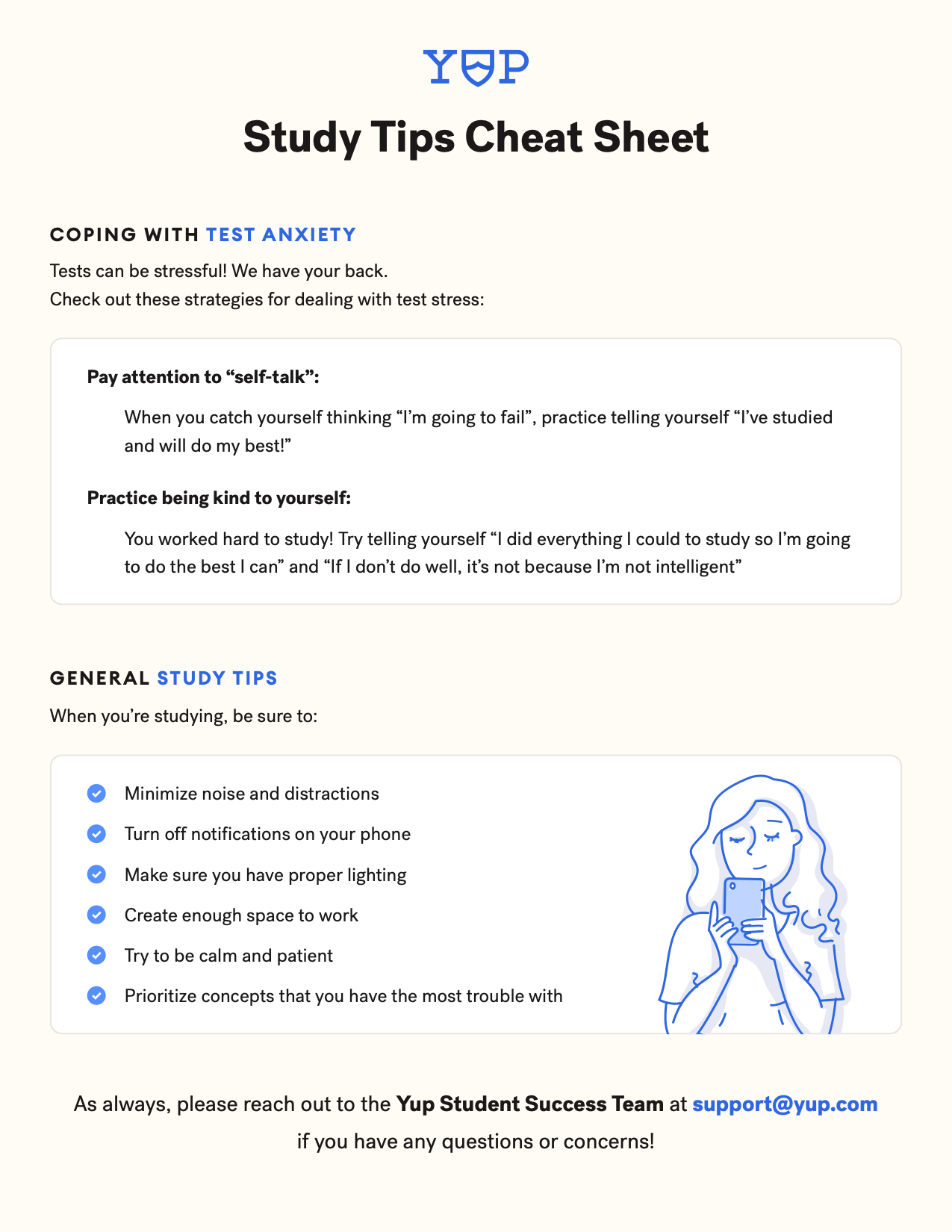
Printables for Customer Success
I designed a number of printables for the Customer Success team, including graduation cards, starter guides, time trackers, and quick references.

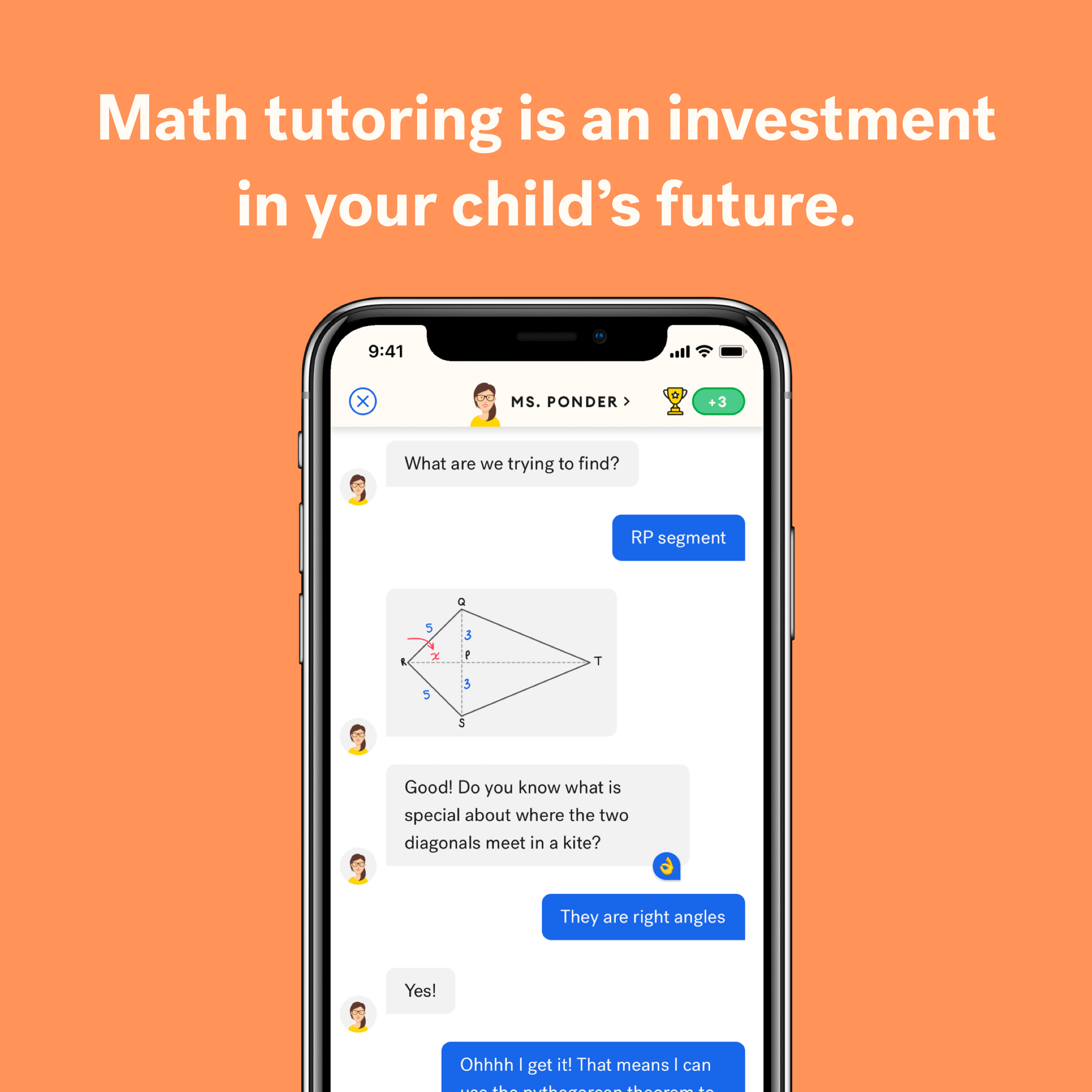
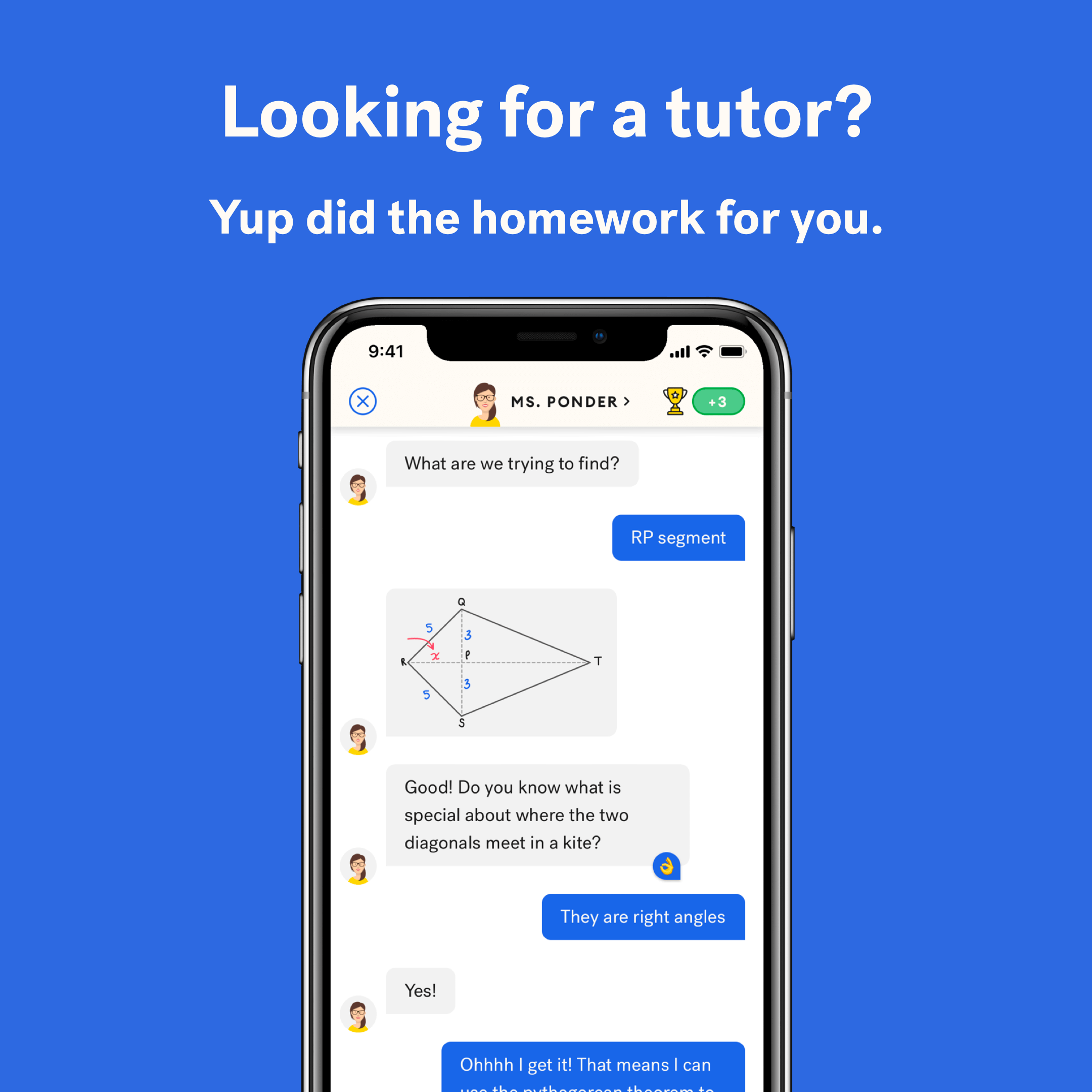
App Store Screenshots
After collaborating on copy and an outline with our Growth and Product teams, I designed the following marketing images for the App and Play Stores.
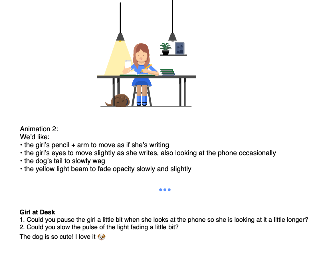
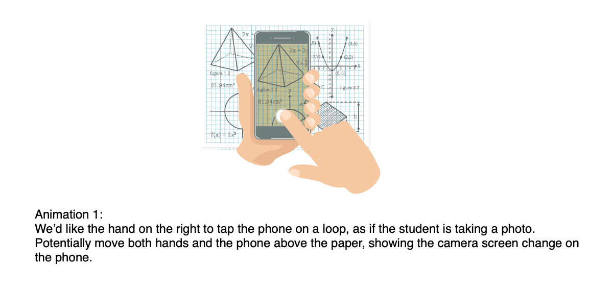
UI Animations
Using Principle, I prototyped a number of UI animations for our Android and iOS apps. These animation prototypes helped explain my ideas to engineers and stakeholders and were later used in product marketing projects. Below are prototypes from two product features:
Graphic Direction for Video Vignettes and TV Spots
I provided visual brand and graphic direction for a series of video vignettes and tv spots made by an agency partner. I was also involved in the concepting, script, content, casting, and camera work by providing ideas and feedback.
I created a number of graphics for the videos, including:


Here are three of the six finalized vignettes and TV spots:
Creative Framework
Using content from colleagues on the Product and Growth teams, I laid out a deck (excerpted below) showcasing our value propositions and brand personality to serve as an introduction to Yup and a quick-reference guide for outside brand partners.


Art Direction for Animations
I commissioned a series of marketing and product animations from the very talented Andru Gavrish. During these projects, I was responsible for drafting an initial proposal, communication, and feedback. Below are some examples of our (excerpted) communication and Andru's amazing output:
Advertisements
Working with our Growth and Sales teams, I designed print advertisements, billboards, and creatives for email and social media marketing (Instagram, Facebook, Google, Snapchat, and Youtube). Here's a sample:


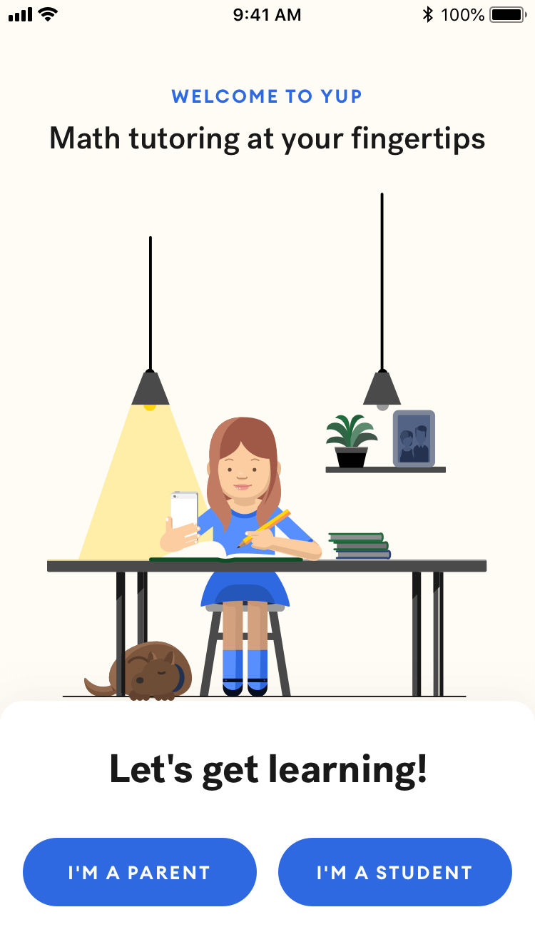
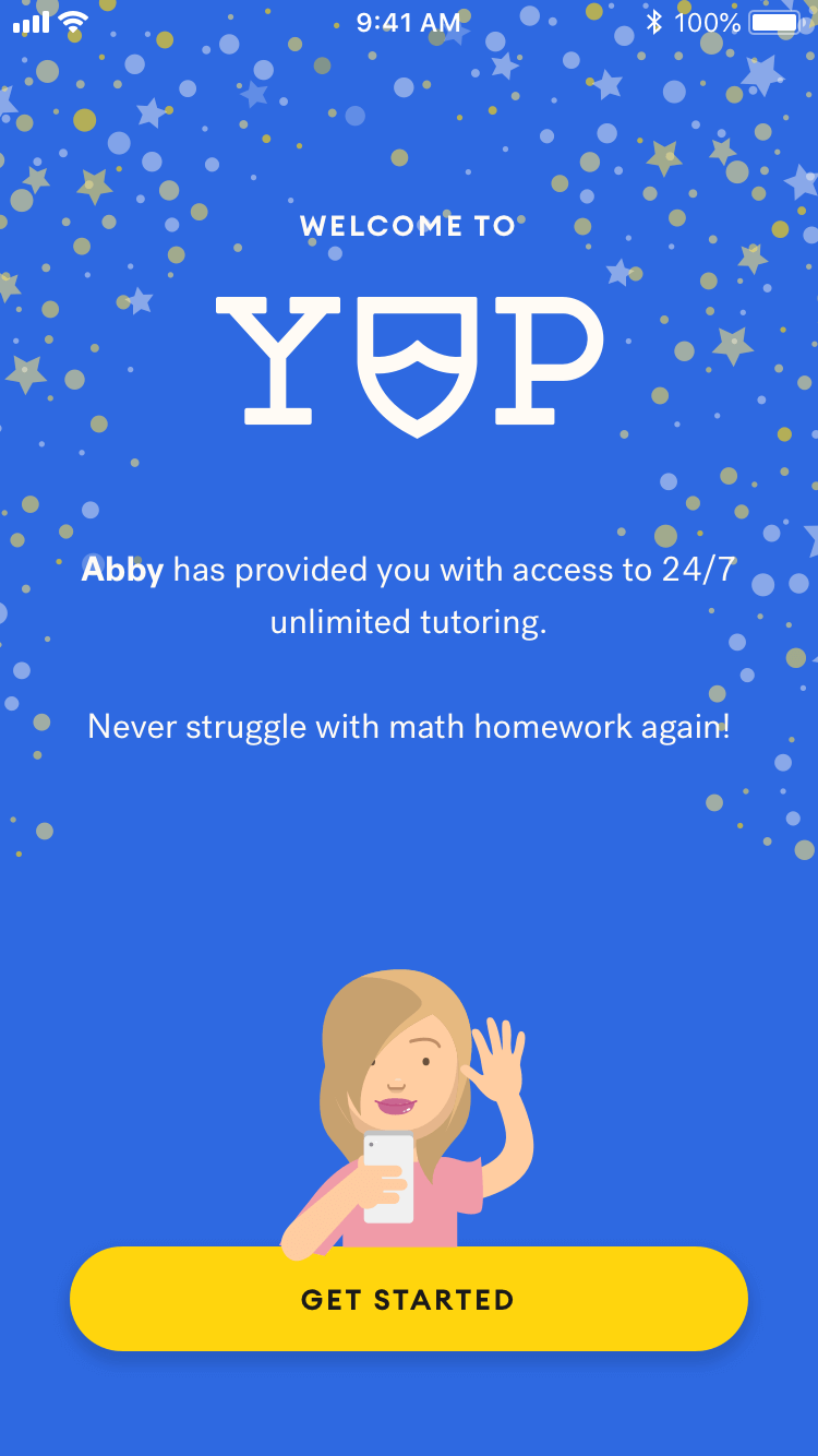
The Rebrand
Shortly after joining the company, I had the opportunity to participate in a visual rebranding. Yup's old visual brand reflected an era of marketing directly to students: playful fonts, a unicorn mascot, and a bright orange and turquoise color palette.
With a new go-to-market strategy of selling Yup plans to parents, Yup needed a more collegiate, mature, and cohesive visual brand.
After rounds of feedback from our CEO, Product team, and myself, our partner agency delivered a new wordmark and set of guidelines for color and typography. The new color palette maintained Yup's bright energy while drawing inspiration from the color schemes of large universities. The more polished brand typefaces reflected a more mature product offering. The new wordmark, influenced by letterman jackets and university crests, sought to cement Yup in parents' minds as a credible educational fixture.
Armed with the new assets and recommendations from our agency partners, I set out on my first projects with the company: redefining the style guide, building a design system, and rebranding our apps, website, purchase flow, and marketing materials.
iOS: Home Screen
iOS: Welcome Screen
iOS: Session View
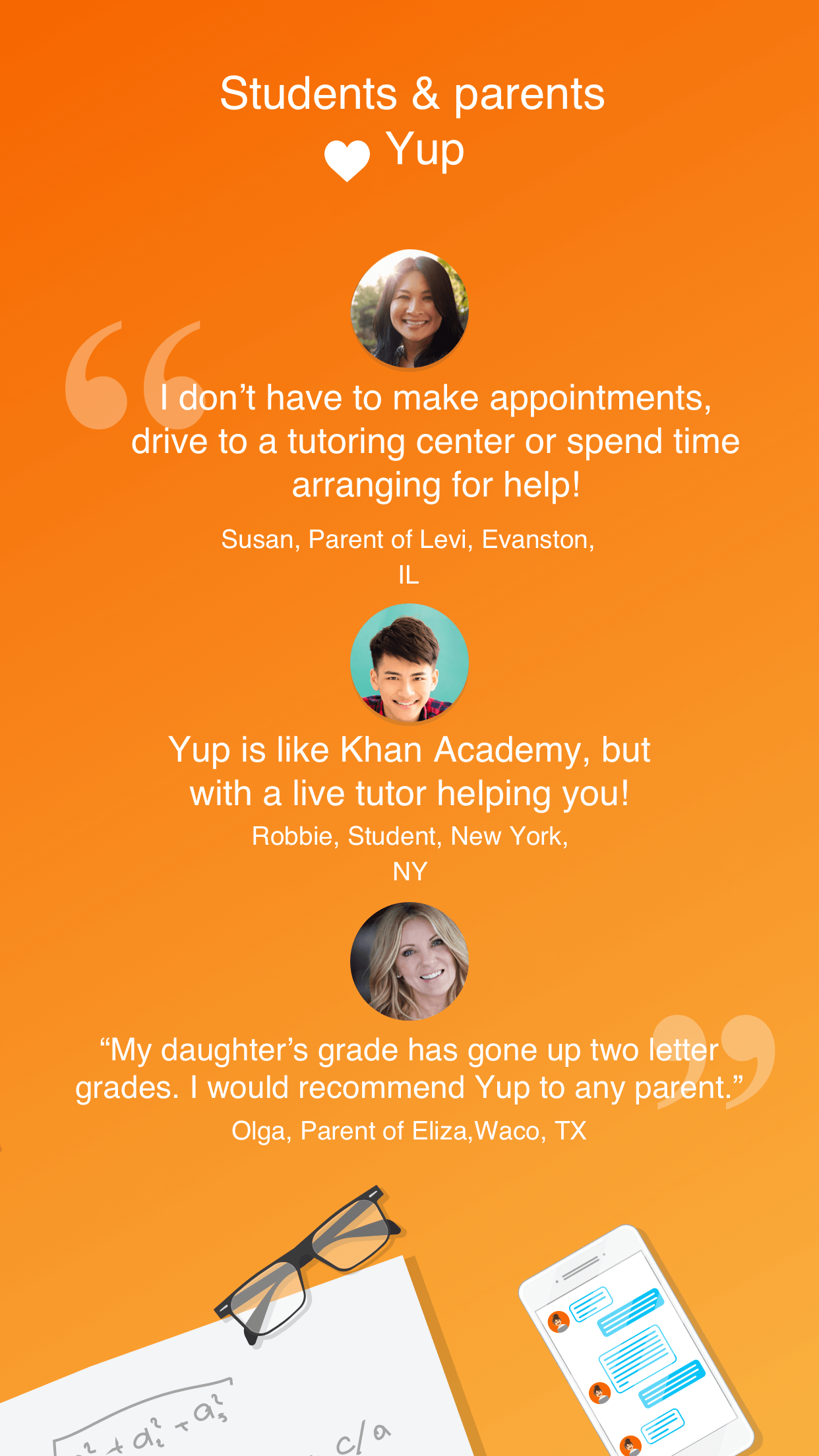
Desktop: Testimonials Module
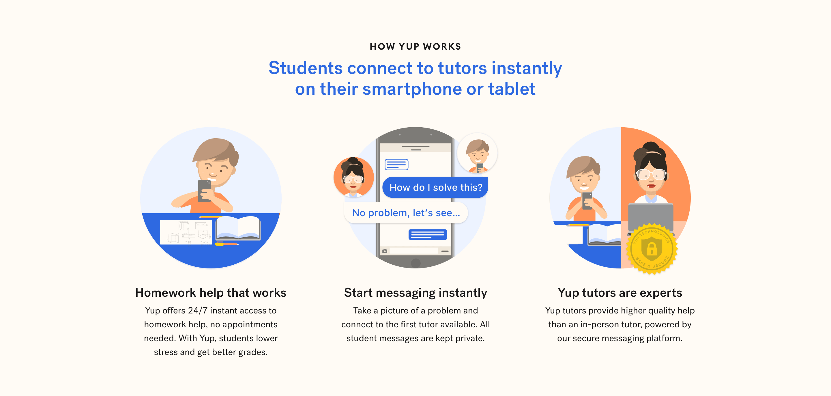
Desktop: "How Yup Works" Module
App Store
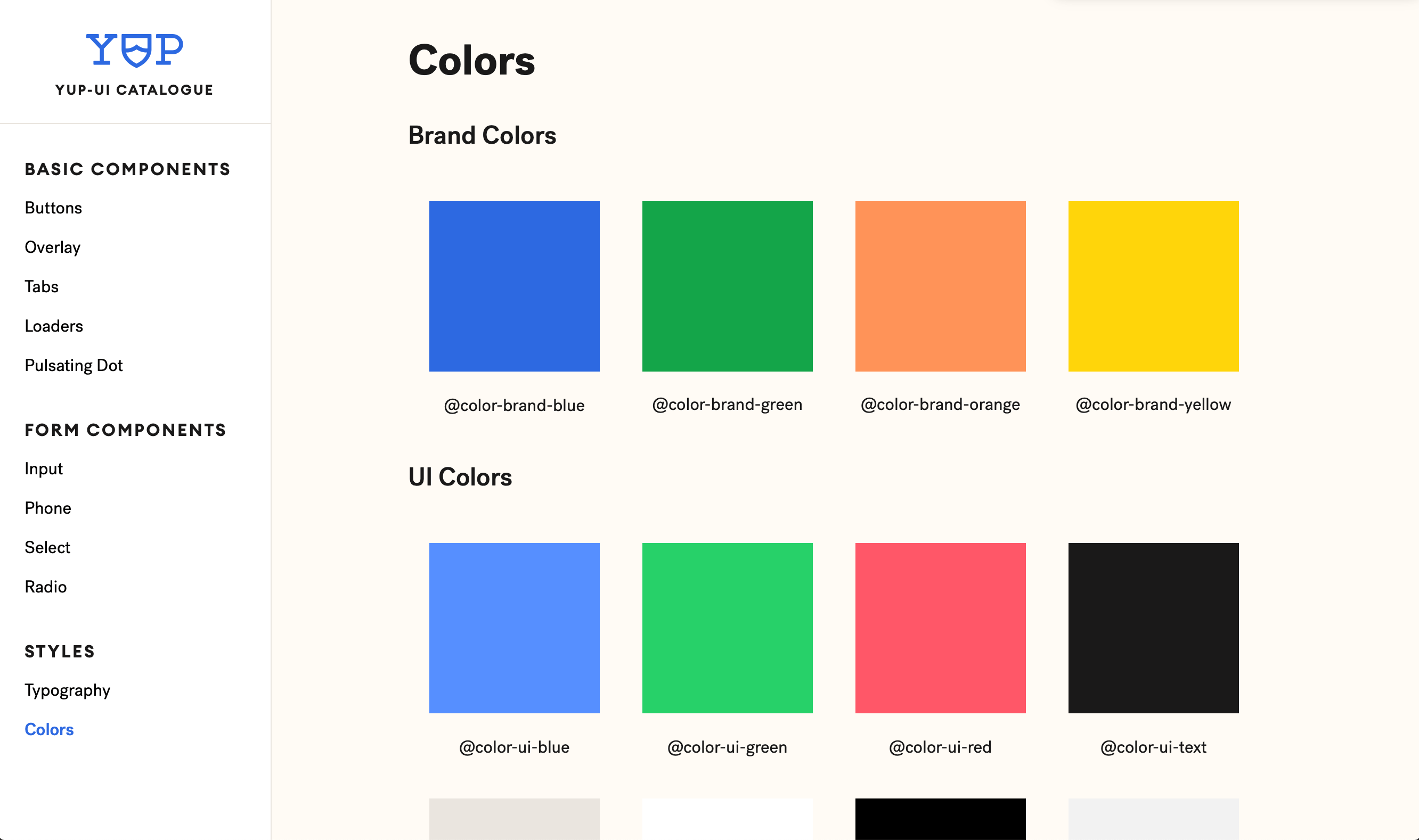
The Design System, yup-ui
I worked with members of the Engineering team to transform components and styles from my Sketch and Figma style guide into a shared Vue.js component library and set of global stylesheets. We started with global styles and the most common components — buttons, tabs, loaders, and form elements. Since then, we've added additional input components, button styles, and modals.